by Eva Murray | Apr 26, 2020 | Makeover Monday, Tableau
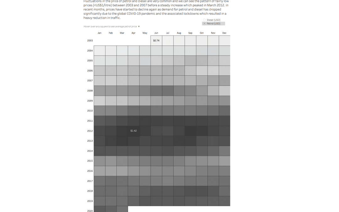
For week 17 we’re looking at UK petrol and diesel prices at a weekly level. Petrol prices at home in Germany are a topic of constant discussion and some people will go to great lengths to save a few cents here and there. Let’s have a look at the original:...
by Eva Murray | Apr 22, 2020 | Tableau
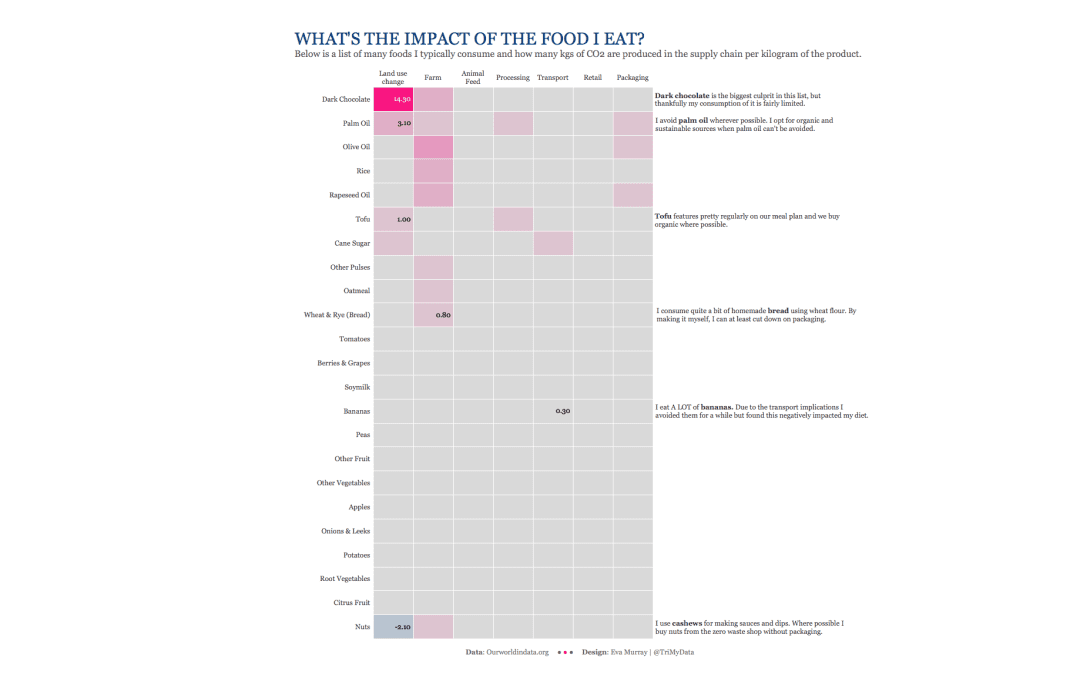
As we all eat multiple times a day, I decided to look for a visualization about food and found this one about the emissions linked to different types of foods. It comes as part of an article about eating local versus focusing on ‘what’ to eat. What works...
by Eva Murray | Apr 13, 2020 | Makeover Monday, Tableau
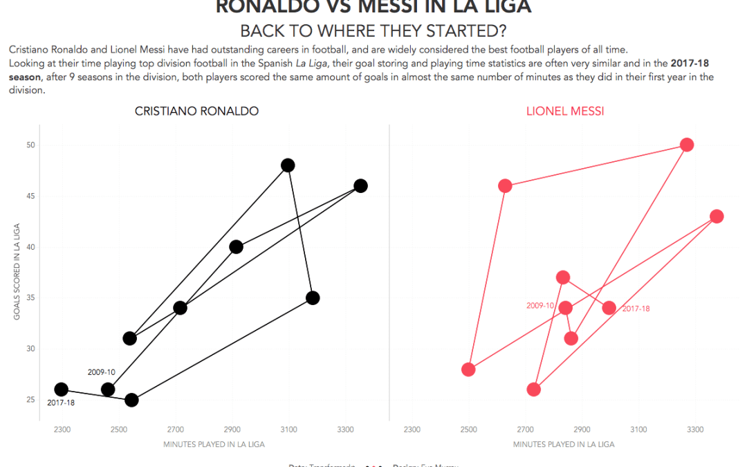
This week it’s a lighter topic. Football. I like it! Charlie chose a Viz from Soccerment, comparing goals per match in La Liga by Messi vs Ronaldo. Here is the original:...
by Eva Murray | Apr 7, 2020 | Makeover Monday, Tableau
It is another week for a Viz5 dataset as part of our collaboration with Operation Fistula. This month, we’re looking at the topic of unpaid work, something so poignant right now that hundreds of millions of people are staying home and as such, unpaid work...
by Eva Murray | Mar 29, 2020 | Tableau
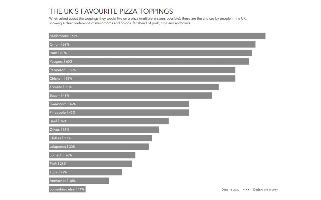
I’m pretty partial to food topics and this week Charlie chose an ‘excellent’ viz very much in need of a makeover, showing people’s favourite pizza toppings. The data behind it is nice and simple, so this week, rather than delaying my viz...
by Eva Murray | Mar 25, 2020 | Tableau
For this week I picked a visualisation that really stood out to me. It’s about the courses on offer at California University and looks like this: https://media.data.world/tI1lUfuRN2hybvZxHLwf_Field%20Distribution.png What works well: Not much, to be honest, but...