I’m pretty partial to food topics and this week Charlie chose an ‘excellent’ viz very much in need of a makeover, showing people’s favourite pizza toppings.
The data behind it is nice and simple, so this week, rather than delaying my viz building until Thursday, I’m actually going to get this done on Sunday before the work week starts.
Here is the original:
What works well:
- The pizza image grabs my attention.
- The labels are nice and large and easy to read.
- The title is short and succinct.
- The footnote is useful.
What could be improved:
- A pie chart does not work for survey data where multiple answers to the same question are possible, because the wedges of a pie should always add up to 100%.
- If Mushrooms are the favourite topping, why are they not listed first, at the very top?
- And why is each wedge the same size, regardless of the number values?
What I did:
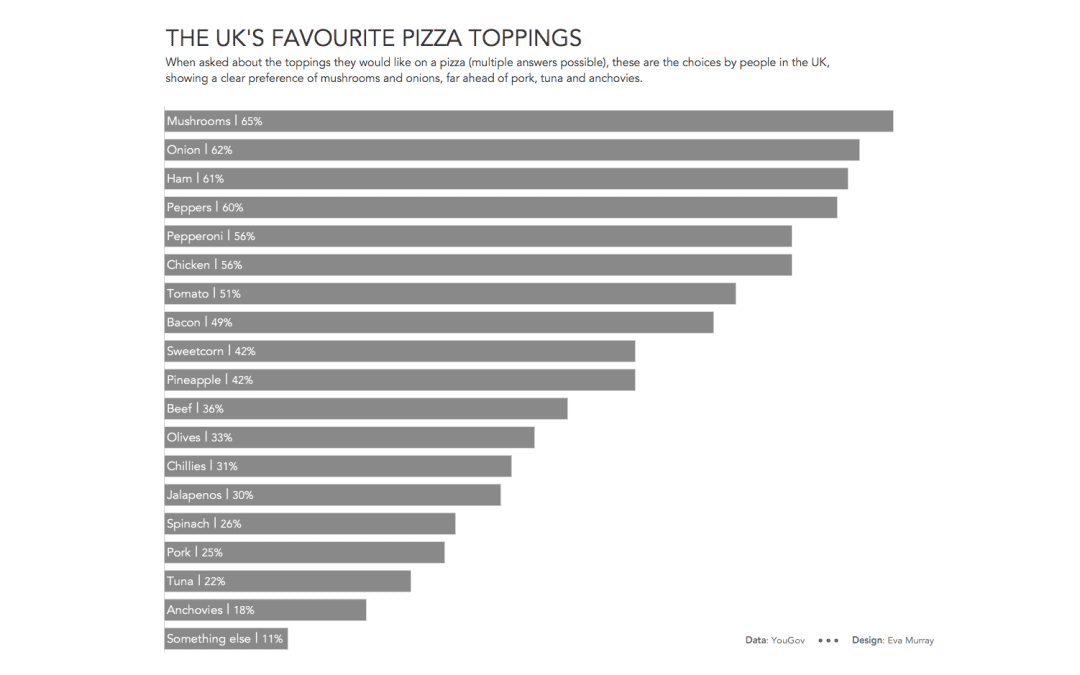
- This screams for a bar chart. One that is neat and simple and sorted in descending order.
- I’m not very courageous when it comes to using images, as I prefer to focus on the data and the things I can control with my very limited knowledge of design stuff.
- So here is a simple bar chart with clear labels, sorted in descending order of preference:


