For week 17 we’re looking at UK petrol and diesel prices at a weekly level. Petrol prices at home in Germany are a topic of constant discussion and some people will go to great lengths to save a few cents here and there.
Let’s have a look at the original:

What works well:
- A simple line chart covering 10 years worth of data and showing how petrol and diesel prices changes over time.
- Nice simple choice of colors.
- clear labelling of dates on x-axis and good labelling of color legend.
- Source is included.
- Title is pretty self-explanatory.
What could be improved:
- There are no insights: What is this chart showing or trying to show me?
- The color green often suggests a ‘green’, environmentally-friendly product, which petrol certainly isn’t, so while green and black work well as colors together, the potential implied meaning doesn’t work.
- the y-axis label needs to be clearer than ‘Values’.
What I did:
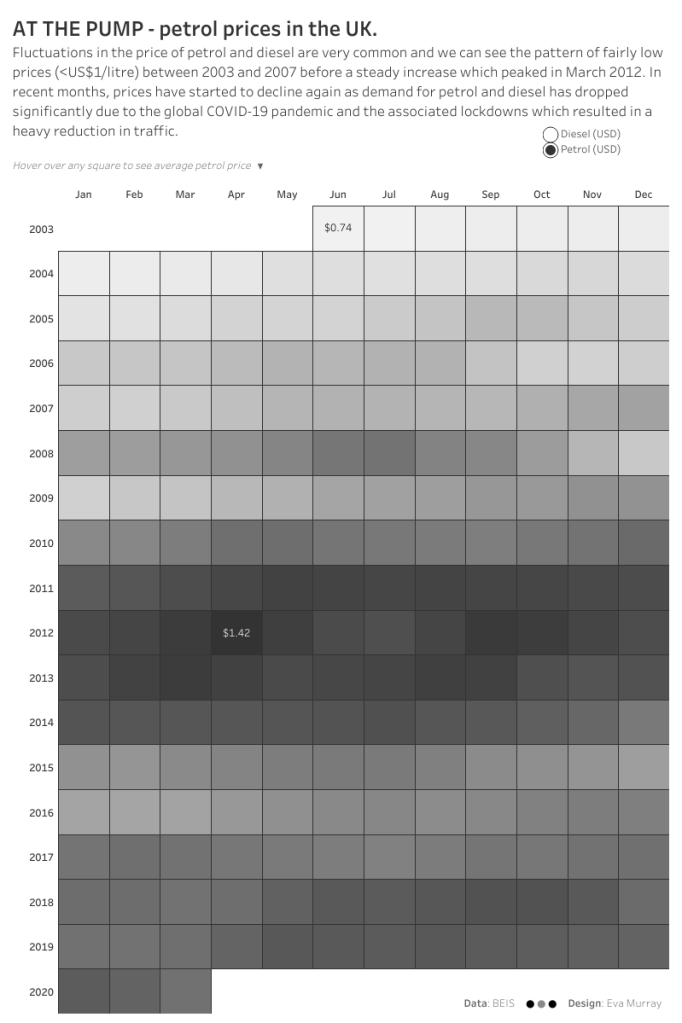
- Admittedly, the line chart is a super effective way of visualising this data, but I’m also a fan of using heat maps to show changes over time. Typically I plot the years vertically and the months horizontally.
- This resulted in a quick monochrome viz from me.
- P.S.: I cannot wait to submit my book on May 1st and find more time for other things again…


