by Eva Murray | Sep 3, 2018 | Tableau
With Tableau’s release of 2018.3 beta and the density maps it gives us, we’re all a bit excited to use geospatial data in novel ways.And because everyone is talking about maps, this week brings another mapping dataset for Makeover Monday.The original viz...
by Eva Murray | Aug 26, 2018 | Tableau
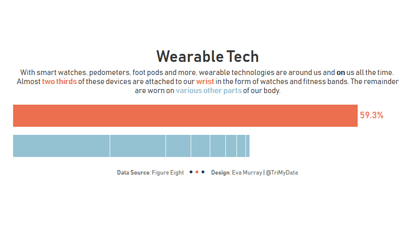
Thanks Andy for making it easy for us this week with a simple bar chart to make over, looking at wearable technology and which body part we attach devices to.Here is the original: What works well: Sorted in descending order from most common to least common location...
by Eva Murray | Aug 19, 2018 | Tableau
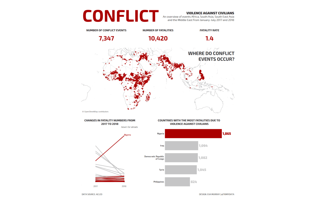
This week we’re collaborating with ACLED to visualize the conflict data they have collected over time.Their original viz looks like this: What works well: Maps always get people’s attention Bright colors that are very different from one another A color...
by Eva Murray | Aug 13, 2018 | Tableau
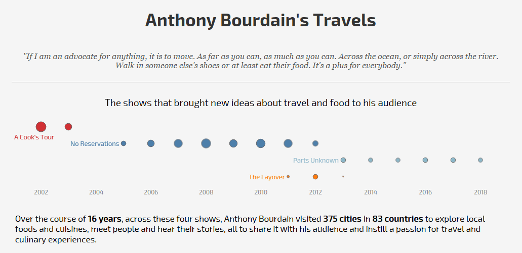
Anthony Bourdain – yes he is a legend and his recent death upset food-loving travelers across the globe. I wasn’t his biggest fan and certainly didn’t agree with enthusiasm for eating animals, but he was an influential personality and I’m sure...
by Eva Murray | Aug 5, 2018 | Makeover Monday, Tableau
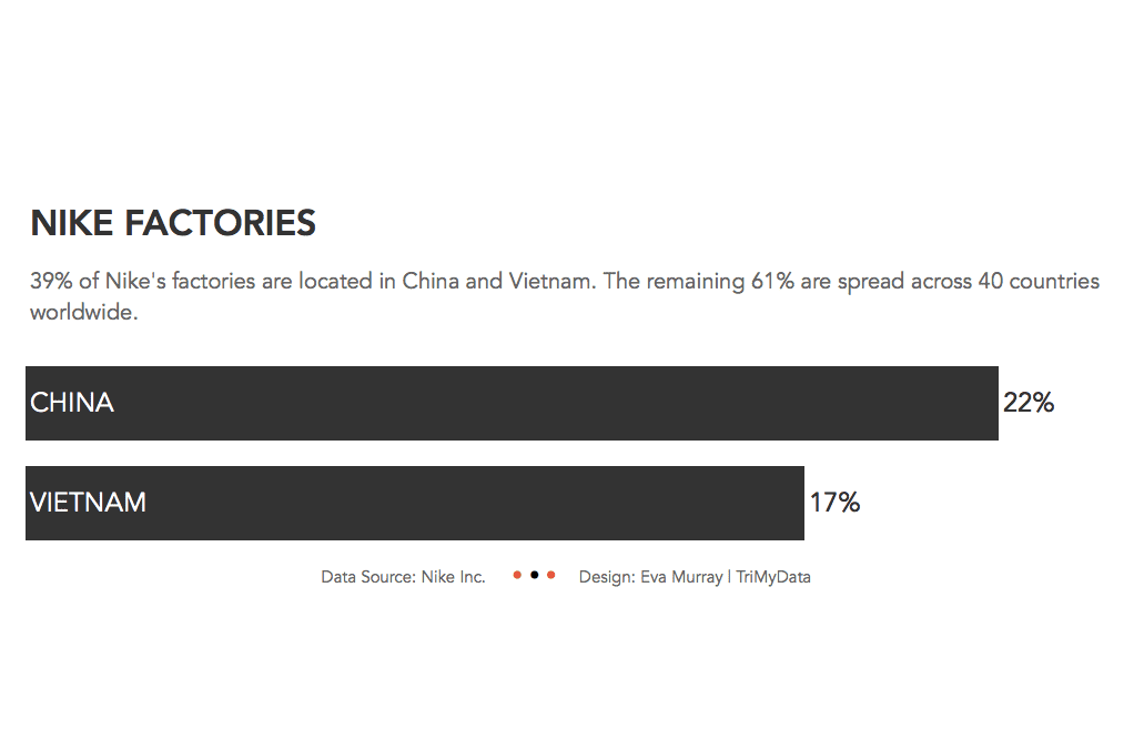
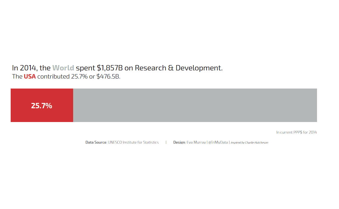
This week’s viz was sent to me by Sarah Bartlett with a ‘WTF’ kinda message and I have to agree. I have seen a lot of bad vizzes and this one has to be in the top 10.We’re looking at what countries spend on Research & Development, data...