This week’s viz was sent to me by Sarah Bartlett with a ‘WTF’ kinda message and I have to agree. I have seen a lot of bad vizzes and this one has to be in the top 10.We’re looking at what countries spend on Research & Development, data which is provided by the UNESCO Institute for Statistics.The original viz looks like this:
What works well:
- The colors and design are very eye-catching and draw my attention to the viz
- The large labels and numbers make it easy to see which countries are the ones spending the most
- The circle design is consistently used for countries where the map shape fits into the circle. This makes it easier to read through the viz
- The sources are included
- The title is simple
What could be improved:
- While the viz clearly shows the four countries which spend the most on R&D, all other information gets lost in colors, shapes and messy-looking labels
- Too many colors – especially for the smaller circles the outlines in the different colors make it all just look messy
- Why the country shape AND flag inside each circle and why do the maps need coloring as well? This is total overkill
- Why the tear-drop shape? It doesn’t give any logical indication of the ranking of countries. The USA are in the middle on the left, the next biggest spender is China on the right, then it goes up, then down, then clockwise via the turquoise and green countries down to the orange ones, then a little bit anticlockwise, then jump to the bottom, more anticlockwise action, then jump from the right to the left bottom and go clockwise from pink over red to burgundy until you reach the country with the smallest amount spent on R&D. WTAF?
- There is no indication on the original viz that these numbers are from 2014.
What I did:
- Data Visualization for me, first and foremost, has the purpose of communicating information clearly and making insights from data easily accessible to an audience.
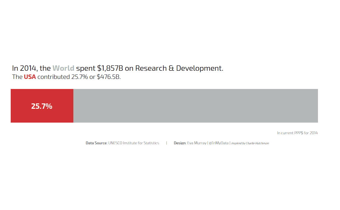
- I focused on one simple message, showing the huge spending on R&D in the US as part of the world total.
- I have also been enjoying the ‘single sheet’ vizzes so decided to build another one of that
- Charlie Hutcheson’s style is focused on clarity and simplicity and I wanted to take the plunge of a simple bar chart ‘the Charlie way’, so here it is…


