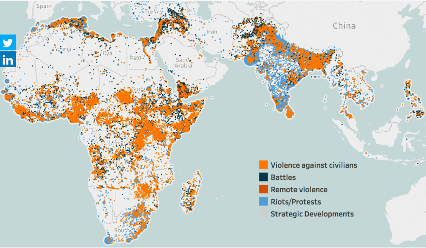
This week we’re collaborating with ACLED to visualize the conflict data they have collected over time.Their original viz looks like this:
What works well:
- Maps always get people’s attention
- Bright colors that are very different from one another
- A color legend that is prominent and uses fairly simple language
- The clustering of circles shows the density of conflicts in different areas
What could be improved:
- There is no title or explanation of what this is, what timeframe it is related to, why the specific countries are shown and who this map is for
- The dots cover each other, making it difficult to see what’s going on in detail
- It would be great to have this map in the context of other visualizations and charts to show a more detailed story about these conflicts
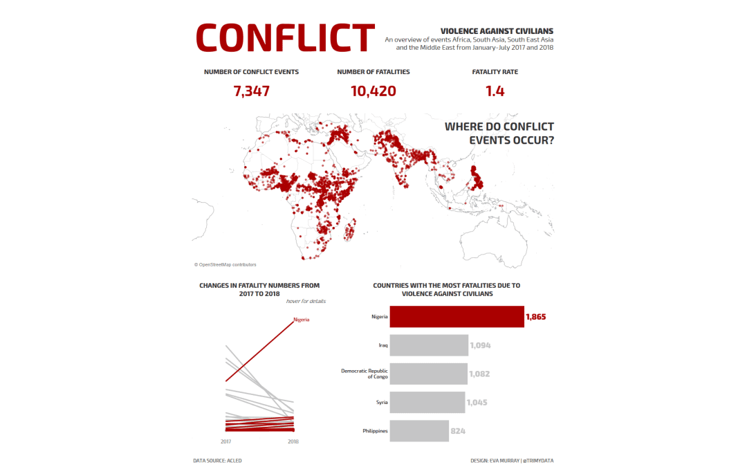
What I did:
- The dataset was really rich, so I wanted to pick out more information to create an overview dashboard
- I decided to focus on violence against civilians
- I chose a simple color palette that will draw attention
- Added interactivity and filters to enable the audience to find some more detailed information
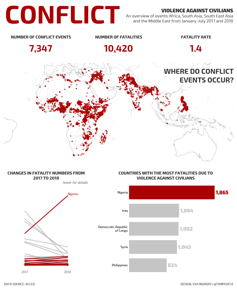
- Used a slope chart that shows increases and decreases in fatalities by country (thanks Andy for helping me with those pesky boolean calculations)
Please click the image below to interact with the viz


[…] visual cue given that this is a conflict primarily about land. Although the design draws heavily on Eva Murray’s makeover, I feel that I’ve found my own story to tell here and made good choices to tell […]