by Eva Murray | Aug 6, 2020 | Tableau
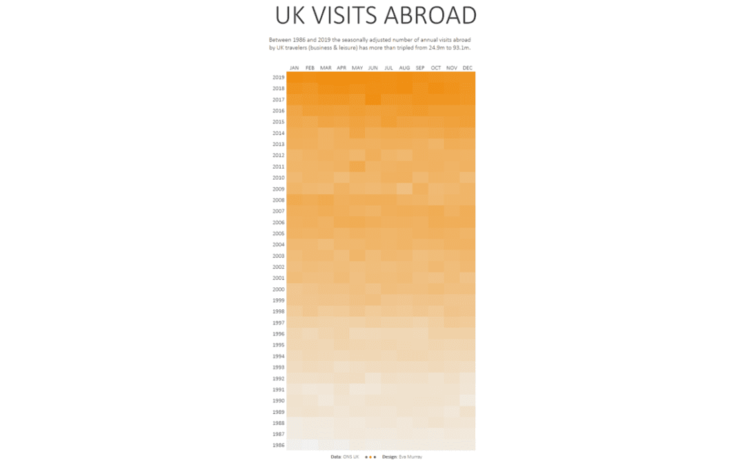
For this week’s #MakeoverMonday we’re looking at how many visits abroad people from the UK are making on a monthly basis. This is the original chart from the Office for National Statistics (ONS): What works well: A line chart is a good choice for this type...
by Eva Murray | Jul 7, 2020 | Makeover Monday, Tableau
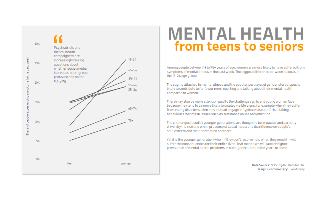
For this week’s #MakeoverMonday, Charlie chose a chart from a BBC article about the prevalence of mental health issues between men and women and across different age groups. Here is the original viz:...
by Eva Murray | Jun 11, 2020 | Makeover Monday, Tableau
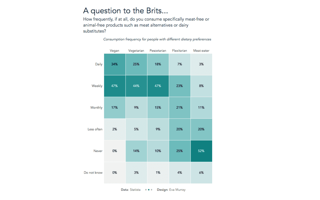
This week Charlie chose a viz about the eating habits of people in the UK. Plant-based foods and a plant-based diet have become more popular, with an increasing number of people also choosing to go vegan. The below visualization is from Statista who asked people how...
by Eva Murray | Jan 20, 2020 | Makeover Monday, Tableau
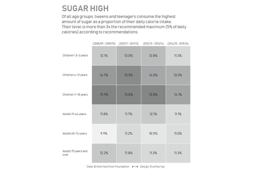
For week 3, Charlie picked an article and a viz about sugar and the high level of consumption of sugar in the UK by different age groups. Here is the original viz from the BBC:...
by Eva Murray | Oct 21, 2019 | Makeover Monday, Tableau
Content warning: This post and the data visualisations within it focus on the topic of suicide. If you are not comfortable with the topic, please don’t feel obliged to continue. If you or someone you know needs help, please contact: Samaritans (UK: 116 123)...