For this week’s #MakeoverMonday we’re looking at how many visits abroad people from the UK are making on a monthly basis.
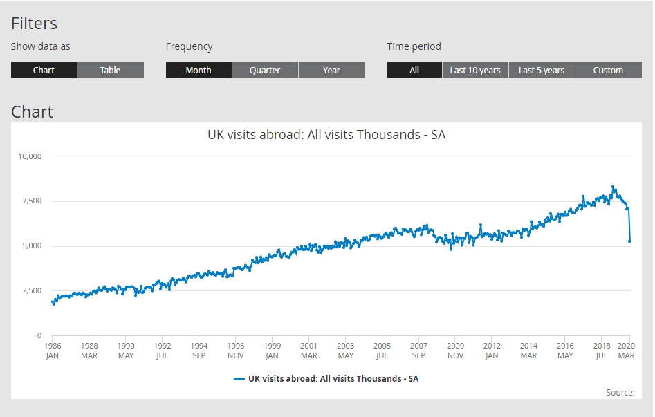
This is the original chart from the Office for National Statistics (ONS):

What works well:
- A line chart is a good choice for this type of data.
- Monthly detail included for 35 years of data.
- Filters let me customise what I want to look at
What could be improved:
- It’s incredibly uninspiring, zero insights or explanations on what the numbers even are. I can only assume they represent individual people from the UK visiting other countries on business and leisure trips, but this isn’t confirmed anywhere on the page.
- The Source is not listed, looks like someone forgot.
- The date increments are chosen at an interval I’m not sure I understand: 26 months between each label just seems odd, why not use 24 months?
What I did:
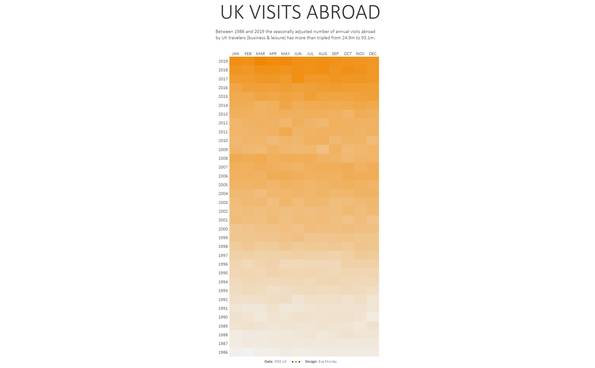
- A simple heatmap that shows the overall changes per month and year and indicates the trend of higher volumes of travel.


