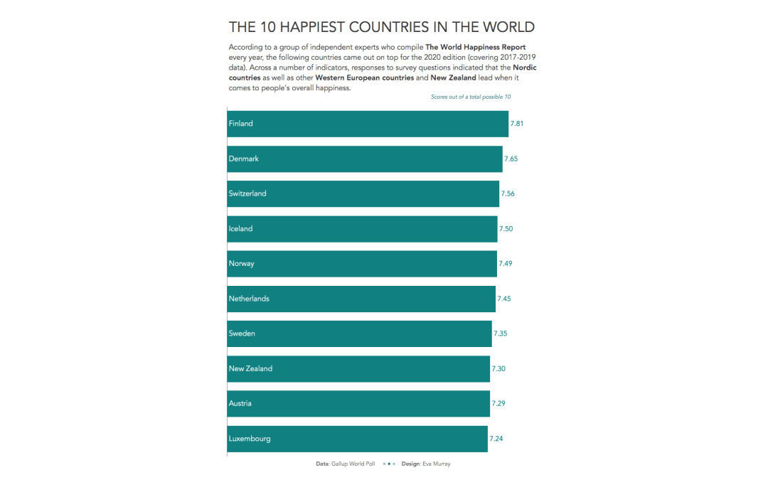
by Eva Murray | May 13, 2020 | Makeover Monday, Tableau
This week we’re looking at the World Happiness Report 2020, which lists over 150 countries in order of their reported happiness, based on a survey conducted by Gallup. This is the viz:...
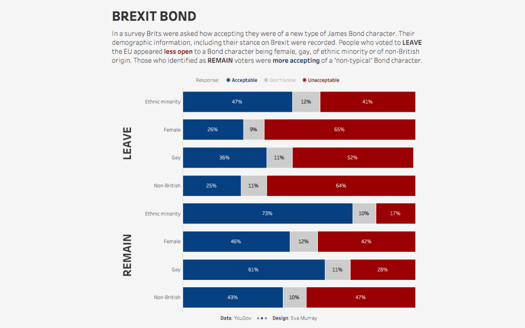
by Eva Murray | Feb 3, 2020 | Makeover Monday, Tableau
For week 5, Charlie picked an interesting dataset, stemming from a survey of Brits on how they voted in political elections as well as their opinion on James Bond actors and how open they are to a future Bond being female, gay, of ethnic minority origin or...
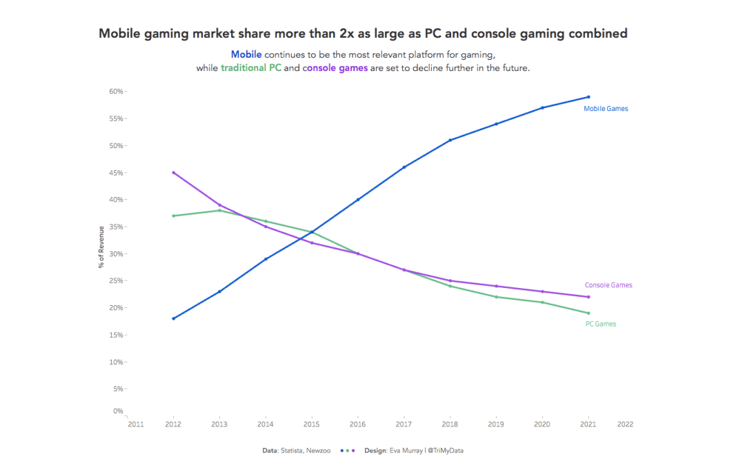
by Eva Murray | Aug 26, 2019 | Makeover Monday, Tableau
For week 35 Andy picked a dataset about gaming and the shift from PCs and consoles to mobile. The original visualization looks like this: What works well: Nice distinct colors that are easy to differentiate from one another Sorted chronologically Title is informative...
by Eva Murray | Mar 25, 2019 | Tableau
For week 13 we are using a viz about consumer spending by generation, using data that indicates what people spend their money on and how it differs depending on how old they are. What works well: A stacked bar chart that goes to 100% makes it easier to compare the...
by Eva Murray | Feb 10, 2019 | Tableau
The president of the United States is a never ending source of news and analysis-worthy headlines. The recent leak of Trump’s daily schedule provided us with a nice dataset to work with for Makeover Monday and there was no hesitation to use it for this...