The president of the United States is a never ending source of news and analysis-worthy headlines. The recent leak of Trump’s daily schedule provided us with a nice dataset to work with for Makeover Monday and there was no hesitation to use it for this week’s challenge.
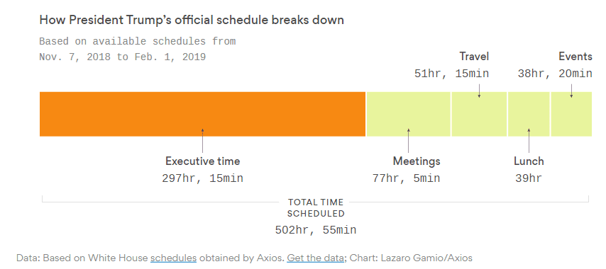
The original chart is part of the Axios article and looks like this:

What works well:
- Informative, concise title
- Executive time, the focus of the article, is highlighted in orange (how fitting!)
- The date range is indicated in the subtitle
- Great labelling
- Data source is listed
- Overall design is neat and the font choice reminds me of typewriter reports you’d see in a movie
What could be improved:
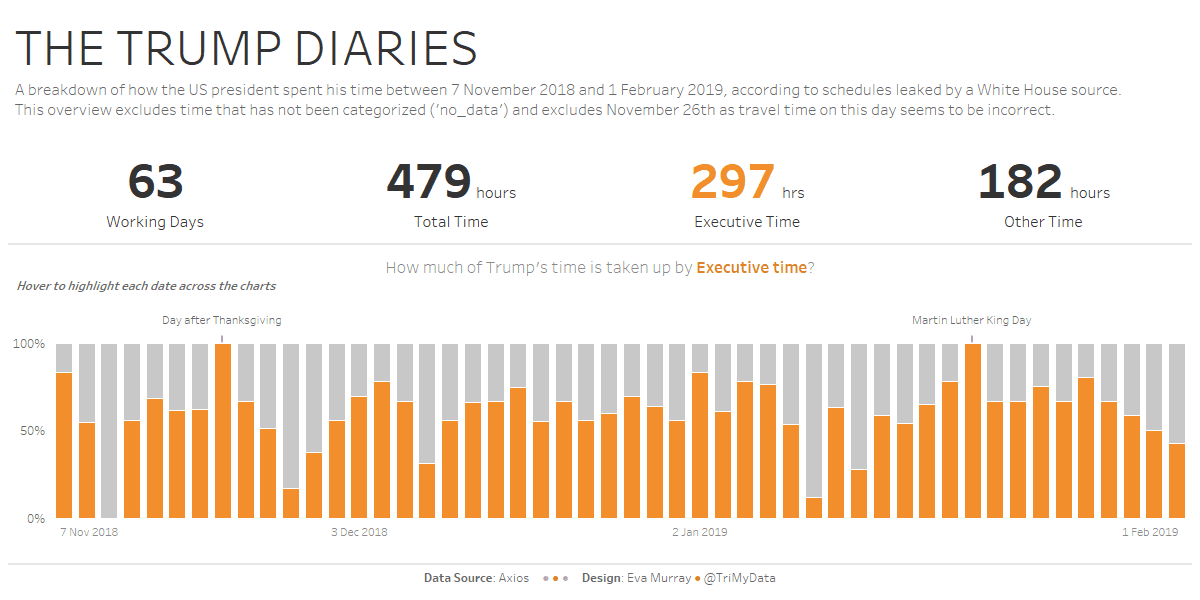
- Adding more context about the number of days and available working hours would help put into perspective what percentage of time is spend on Executive time
- What is typical? I’m sure the data for other presidents isn’t readily available, but I’d be curious to see how other presidents spend their time, so I can compare their data to that from Trump
What I focused on:
- This was another one of those datasets that required quite a bit of digging around before I found something I wanted to focus on
- I spent a bit of time working through different ideas, wrangling with calculations and figuring stuff out that I ended up not using 🙂
- This week I wanted to include some BANs and a couple of vizzes.
- In the end, thanks to Andy’s feedback I culled two charts that didn’t add much to the story (even if I really liked my scatterplot)

