by Eva Murray | May 6, 2019 | Tableau
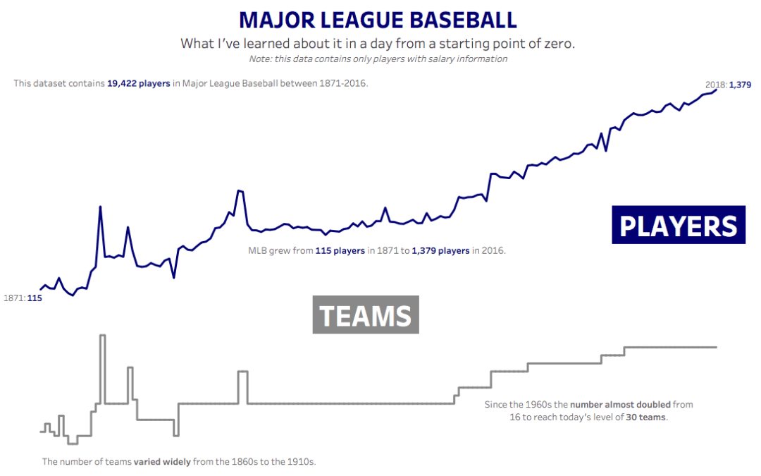
For week 19 Andy picked baseball data and I’ll be the first to admit that I expected it to not be fun, because it’s a topic I know nothing about and I wasn’t quite ready to spend hours learning about baseball. Until I did. Here is the original viz:...
by Eva Murray | Apr 22, 2019 | Tableau
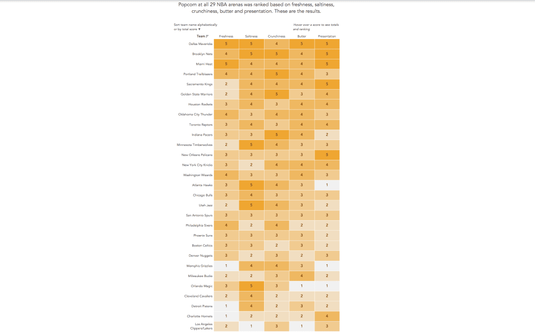
Andy found a great dataset for this week’s challenge: rankings of stadium popcorn at NBA stadiums across the US. It’s in an article by the New York Times and here is the viz itself: What works well: It’s a great viz of the ranking with clear labels...
by Eva Murray | Mar 25, 2019 | Tableau
For week 13 we are using a viz about consumer spending by generation, using data that indicates what people spend their money on and how it differs depending on how old they are. What works well: A stacked bar chart that goes to 100% makes it easier to compare the...
by Eva Murray | Feb 10, 2019 | Tableau
The president of the United States is a never ending source of news and analysis-worthy headlines. The recent leak of Trump’s daily schedule provided us with a nice dataset to work with for Makeover Monday and there was no hesitation to use it for this...
by Eva Murray | Feb 3, 2019 | Tableau
One of the fun aspects of #MakeoverMonday is to pick a dataset each week. When I don’t have something obvious in mind or haven’t looked at the ‘backlog’ of options yet, I tend to check the calendar for significant events that we could viz...