by Eva Murray | Sep 3, 2018 | Tableau
With Tableau’s release of 2018.3 beta and the density maps it gives us, we’re all a bit excited to use geospatial data in novel ways.And because everyone is talking about maps, this week brings another mapping dataset for Makeover Monday.The original viz...
by Eva Murray | Aug 26, 2018 | Tableau
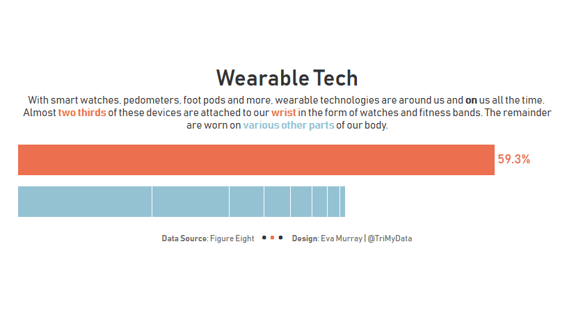
Thanks Andy for making it easy for us this week with a simple bar chart to make over, looking at wearable technology and which body part we attach devices to.Here is the original: What works well: Sorted in descending order from most common to least common location...
by Eva Murray | Aug 19, 2018 | Tableau
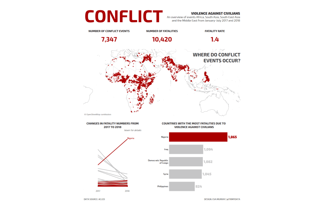
This week we’re collaborating with ACLED to visualize the conflict data they have collected over time.Their original viz looks like this: What works well: Maps always get people’s attention Bright colors that are very different from one another A color...
by Eva Murray | Aug 13, 2018 | Tableau
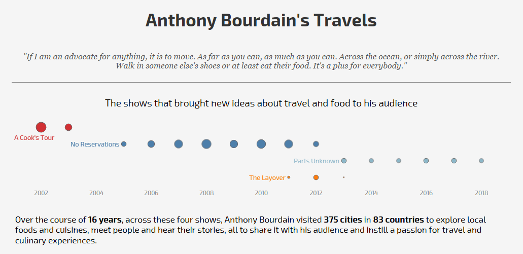
Anthony Bourdain – yes he is a legend and his recent death upset food-loving travelers across the globe. I wasn’t his biggest fan and certainly didn’t agree with enthusiasm for eating animals, but he was an influential personality and I’m sure...
by Eva Murray | Jul 31, 2018 | Tableau
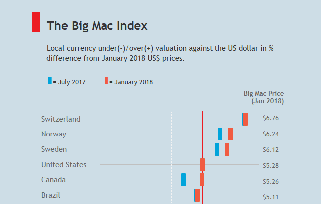
This week we’re working on the dataset behind the Big Mac Index. Many from the community will be familiar with the topic because it featured in this year’s Ironviz Europe contest.A few weeks ago, Andy Cotgreave introduced us to the data team at the...