by Eva Murray | Feb 24, 2020 | Makeover Monday, Tableau
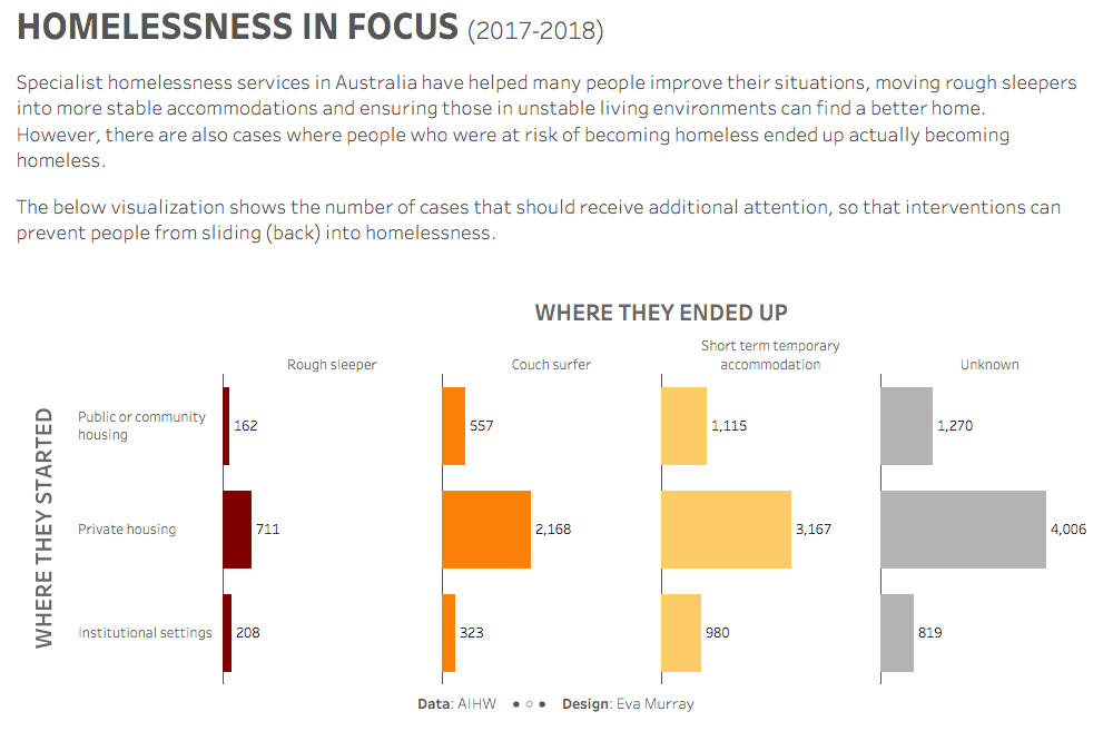
For week 8 I chose a dataset from the Australian Institute of Health and Welfare, looking at homelessness statistics and, more particularly, the outcomes of specialist homelessness services. The original visualization was published on AIHW’s website:...
by Eva Murray | Oct 2, 2019 | Tableau
For week 40 I chose a rich dataset with a simple viz showing population predictions for London. The original viz looks like this: https://media.data.world/Iz4UmqNeRlmouvVKnBXx_Screen%20Shot%202019-09-28%20at%207.23.28%20pm.png What works well: A simple bar chart...