by Eva Murray | Mar 14, 2021 | Uncategorized
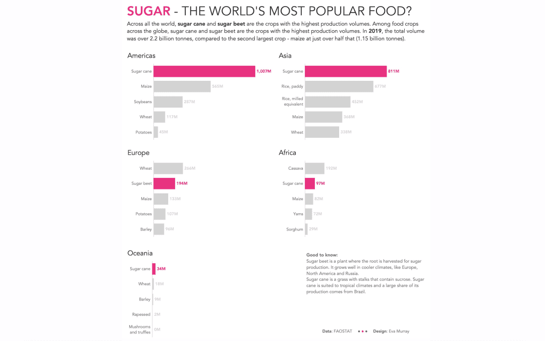
The visualizations we use for #MakeoverMonday are usually in need of a makeover but sometimes we use visuals that are already really good, and they cover an interesting topic or really good dataset.This week we’re looking at crops – what’s grown, how efficient...
by Eva Murray | Oct 20, 2020 | Makeover Monday, Tableau
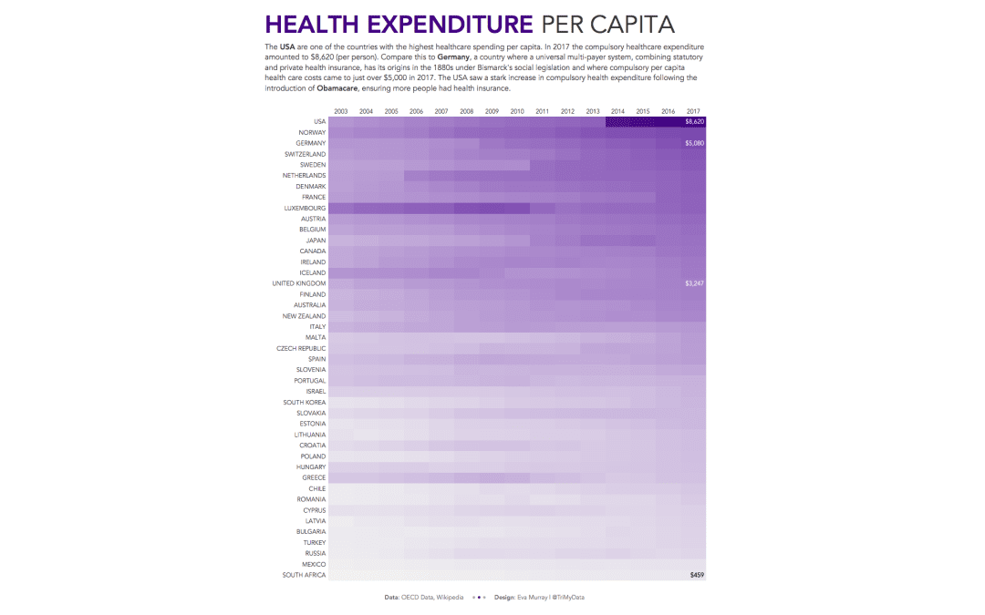
A quick viz this week and a quick blog, looking at health spending per capita in different countries. I’ll admit, I wanted to do a heat map before even looking at the data, so a heat map it is. This week we’re looking at OECD data about healthcare...
by Eva Murray | Oct 28, 2019 | Tableau
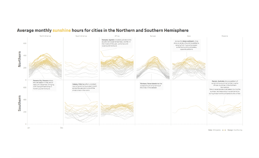
Before winter really takes hold, let’s look at some sunshine hours in cities around the world. Here is this week’s original: What works well: Captivating visual that makes me curious The bar charts at the bottom are nice Top 5 lists at the beginning are...
by Eva Murray | Apr 23, 2018 | Tableau
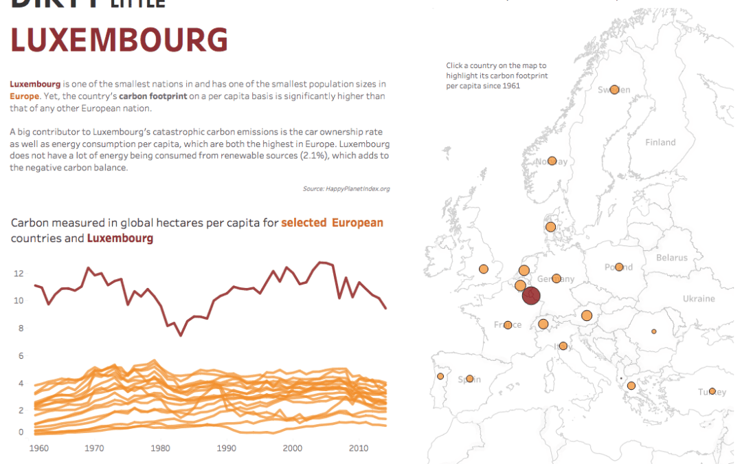
After a week of malaria vizzes which had me very excited about the enthusiasm from the Makeover Monday community, we are turning our focus to Earth Day this week and the ecological footprint per capita for different countries.The original chart comes from the...