by Eva Murray | Nov 4, 2019 | Tableau
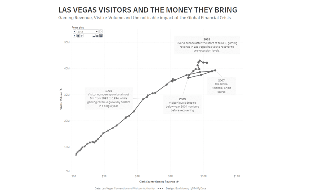
For week 45, Andy selected a dataset about Las Vegas. Itcontains a number of metrics, including visitor numbers, gaming revenue,occupancy rates, etc. This is the original viz What works well: The bar chart is simply and easy to read The line shows an interesting...
by Eva Murray | Jan 12, 2019 | Tableau
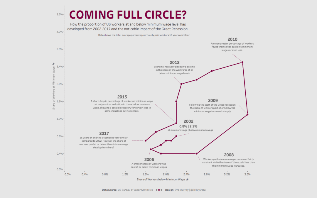
Week 3 is upon us and we’re moving from Freedom of the Press to minimum wages in the US. The viz to makeover this week is the following map showing for each stage the percentage of workers earning the minimum wage or less. What works well: A map is often a viz...