by Eva Murray | Aug 19, 2018 | Tableau
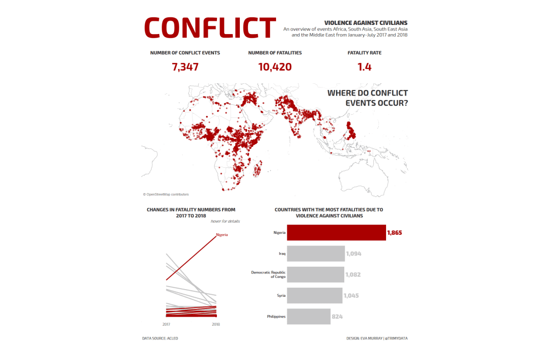
This week we’re collaborating with ACLED to visualize the conflict data they have collected over time.Their original viz looks like this: What works well: Maps always get people’s attention Bright colors that are very different from one another A color...


