by Eva Murray | Jul 31, 2018 | Tableau
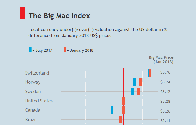
This week we’re working on the dataset behind the Big Mac Index. Many from the community will be familiar with the topic because it featured in this year’s Ironviz Europe contest.A few weeks ago, Andy Cotgreave introduced us to the data team at the...
by Eva Murray | Jul 28, 2018 | Life stuff
In a recent conversation with a friend it became clear to me that too often we think there isn’t enough of something, resulting in jealousy and envy, leading to negative thoughts and behaviours. Is it justified? Most of the time the scarcity we have in our mind...
by Eva Murray | Jul 22, 2018 | Tableau
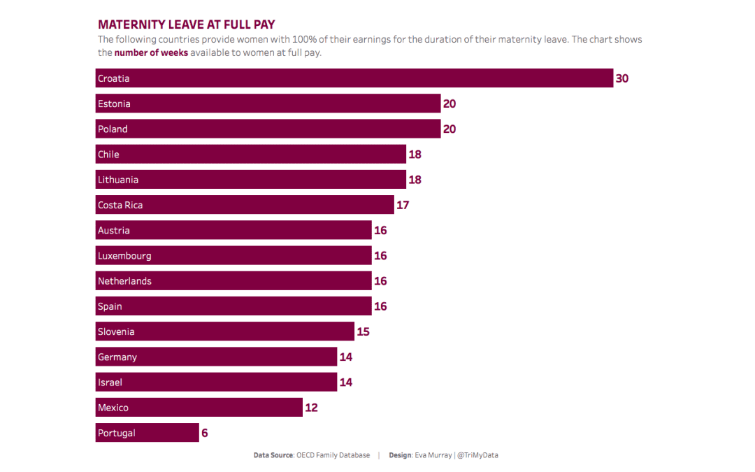
In the past few days I noticed a number of discussions on social media around maternity and parental leave in different countries and, more specifically, the lack of paid maternity leave in the US. So I chose a dataset that shows the number of weeks of maternity and...
by Eva Murray | Jul 16, 2018 | Tableau
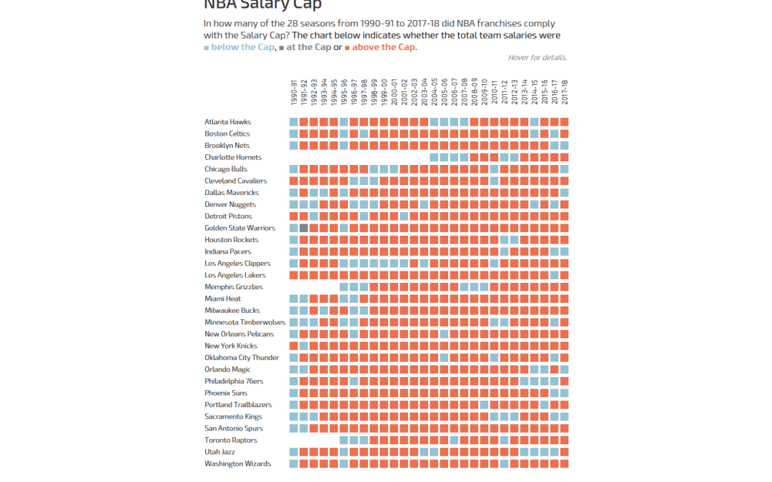
Andy actually did it: he pulled Basketball data on me! But hey, all good, we all have to occasionally work with data we know nothing about.The original viz comes from What’s the Cap? and shows a combined bar chart and line chart to indicate how high the salary...
by Eva Murray | Jul 9, 2018 | Tableau
After an exciting week in London last week with #TC18Europe and a Data School project, as well as additional meetings on Monday and Friday, and a training session with our friends from Mapbox, I decided on a dataset for Makeover Monday that contains lots of geospatial...