After an exciting week in London last week with #TC18Europe and a Data School project, as well as additional meetings on Monday and Friday, and a training session with our friends from Mapbox, I decided on a dataset for Makeover Monday that contains lots of geospatial information. Enter: Volcanic Eruptions.I saw this viz a while ago and really liked it. I also thought the dataset was really cool, so it made the list for MakeoverMonday and here it is…
What works well:
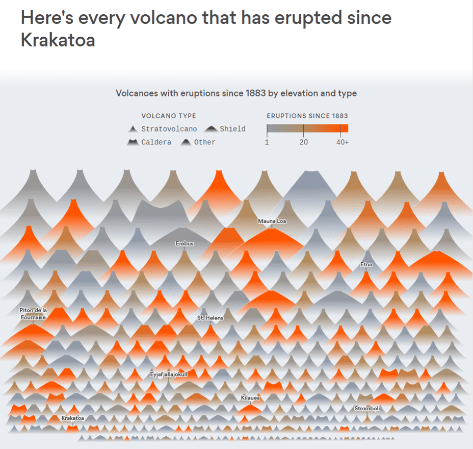
- The visual representation of the volcanoes is capturing my attention with the shapes, sorting by size and the colors throughout the viz
- Simple title that suggests that every volcano is represented by a single shape
- The colors make it easy to spot very active versus very inactive volcanoes
- Selected labels throughout the viz give reference points for well-known and/or recently active volcanoes
- Great tooltips!
What could be improved:
- I’d like to see the geographical location represented in the viz. This is available in the tooltip
- A timeline would also be great to get an indication when most of these eruptions occurred
- Other than that, I love the original viz and wouldn’t change anything 🙂
What I did:
- There is so much in the data. I had plenty of ideas of how I wanted the design to look, but once again I hit my creative limits
- Instead, I spent a fair amount of time exploring the data, finding relationships and using highlight actions to see where things were happening
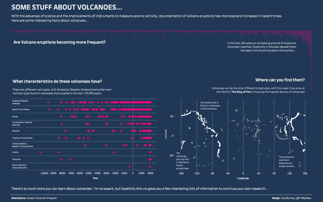
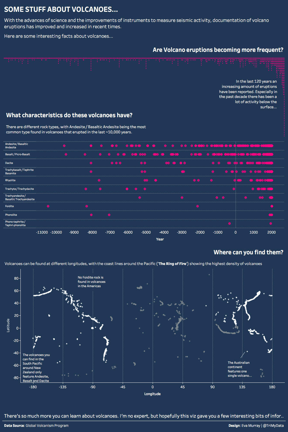
- I ended up with a dashboard that I’m fairly happy with. I hope it helps people find a bit of interesting information about volcanoes 🙂
- Click to explore and hover, hover, hover


