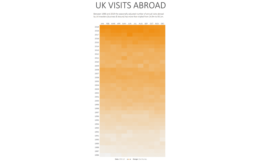
by Eva Murray | Aug 6, 2020 | Tableau
For this week’s #MakeoverMonday we’re looking at how many visits abroad people from the UK are making on a monthly basis. This is the original chart from the Office for National Statistics (ONS): What works well: A line chart is a good choice for this type...
by Eva Murray | Jul 28, 2020 | Tableau
This week sees us tackle another #Viz5 dataset, focusing on a gender equality topic: women in power, i.e. the parliamentary representation of women. The dataset comes from the World Bank and the team at Operation Fistula created a visualization for us to use as a...
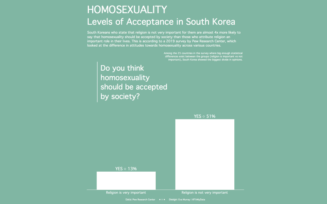
by Eva Murray | Jul 21, 2020 | Tableau
#MakeoverMonday is a great learning tool for anyone who participates and I’ve enjoyed the more challenging topics lately, because they result in such great work from our community. People really put in the effort when a topic is a bit heavier and requires more...
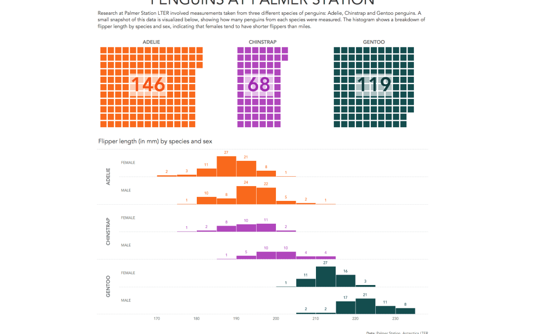
by Eva Murray | Jul 16, 2020 | Makeover Monday, Tableau
Sometimes I stumble across dataviz gems with topics that make me smile. This is one of those weeks with the topic being the flipper and bill length of different types of penguins in Antarctica. The original viz and fantastic data prep work + art work comes from...
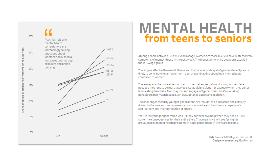
by Eva Murray | Jul 7, 2020 | Makeover Monday, Tableau
For this week’s #MakeoverMonday, Charlie chose a chart from a BBC article about the prevalence of mental health issues between men and women and across different age groups. Here is the original viz:...