by Eva Murray | Dec 9, 2020 | Makeover Monday, Tableau
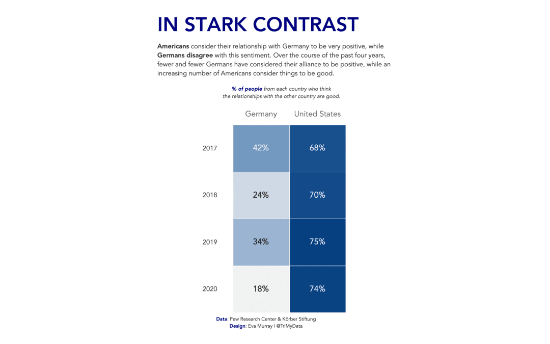
For this week Charlie picked an interesting topic: The perception among the population of how positive the relationship is between the US and Germany. The data came from a survey and the entire article can be found here. Here is the original visualization:...

by Eva Murray | Mar 25, 2020 | Tableau
For this week I picked a visualisation that really stood out to me. It’s about the courses on offer at California University and looks like this: https://media.data.world/tI1lUfuRN2hybvZxHLwf_Field%20Distribution.png What works well: Not much, to be honest, but...
by Eva Murray | Mar 3, 2020 | Tableau
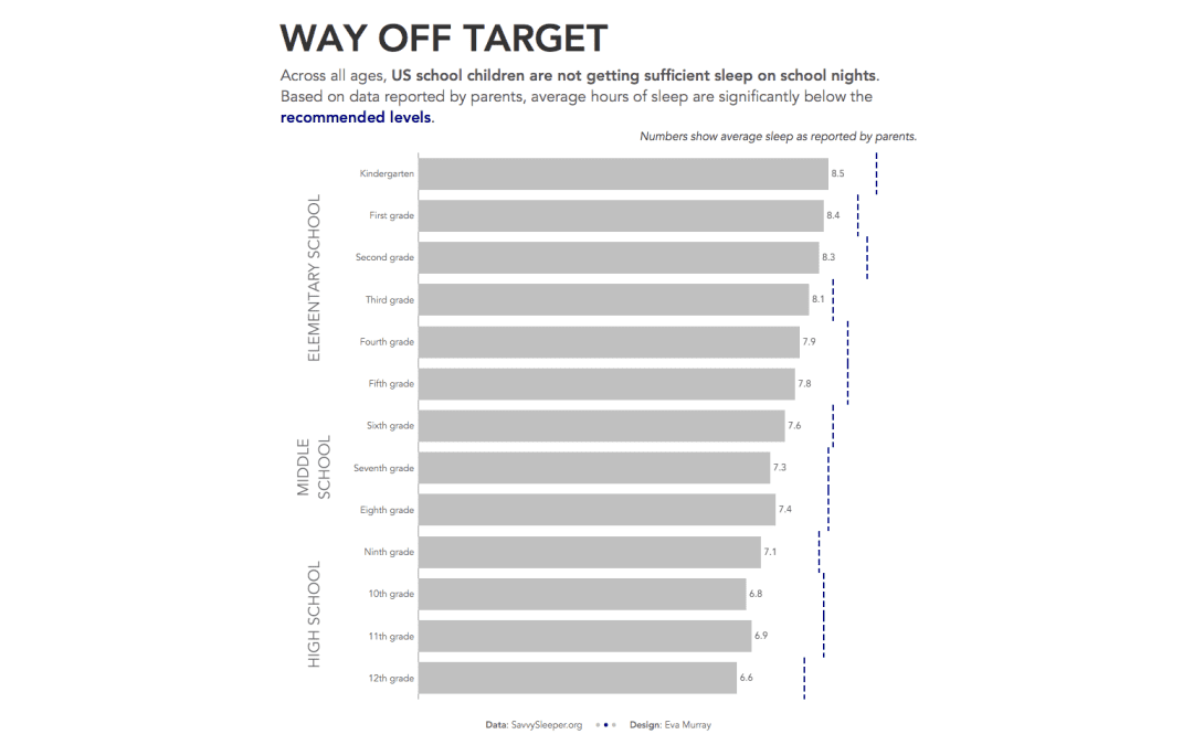
On a Monday morning here in London, the topic of sleep seems pretty appropriate, I have to admit, because getting enough sleep between various work and life commitments (and choices) can be a struggle. Charlie chose the following viz for this week’s...
by Eva Murray | Jan 6, 2020 | Tableau
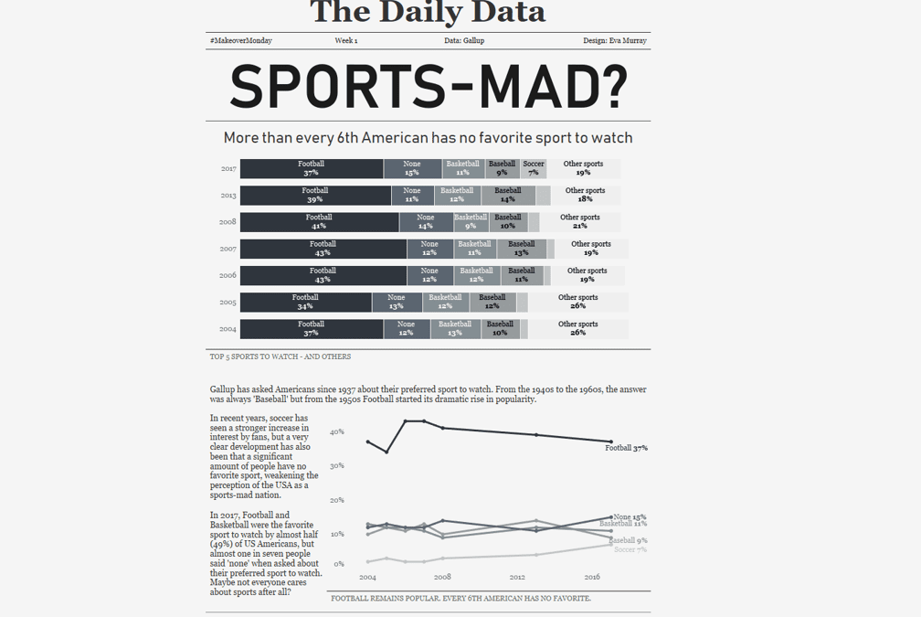
For his first dataset, Charlie picked the topic of how popular different American sports are with spectators. Here is the original viz from Vox.com What works well: A nice and simple chart Lines are labeled I like the focus on the top 3 Colors are easy to...