by Eva Murray | Nov 25, 2020 | Makeover Monday, Tableau
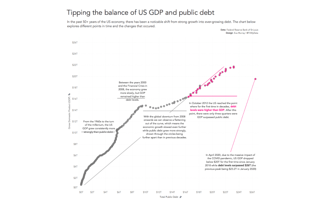
This week is, much like many recent weeks, a busy one for me with many commitments that mean MakeoverMonday had to be delayed by a couple of days. But here we are, ready to build a viz about the debt of the US. The original infographic Charlie chose for this exercise...
by Eva Murray | Nov 16, 2020 | Makeover Monday, Tableau
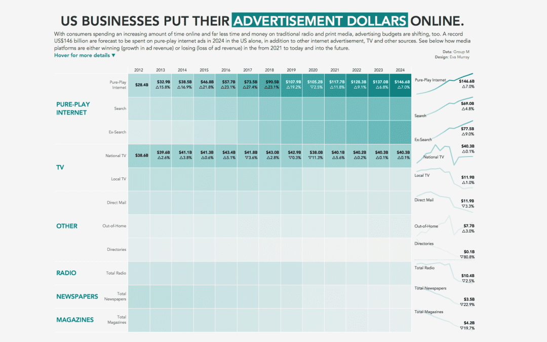
Andy found a great viz for this week’s #MakeoverMonday challenge and kindly dug out the data for me as well as I’m managing a few different projects at the same time. This week we’re looking at advertising spend in the US with the original viz...
by Eva Murray | May 18, 2020 | Makeover Monday, Tableau
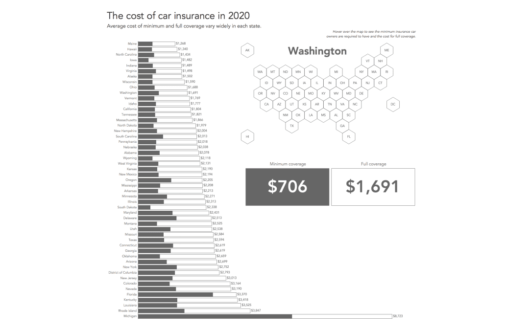
For this week’s MakeoverMonday challenge we are looking at car insurance rates – the minimum and the maximum – for each US state. There are significant differences between the states and the visualization I found that aims to show these differences...
by Eva Murray | Dec 2, 2019 | Makeover Monday, Tableau
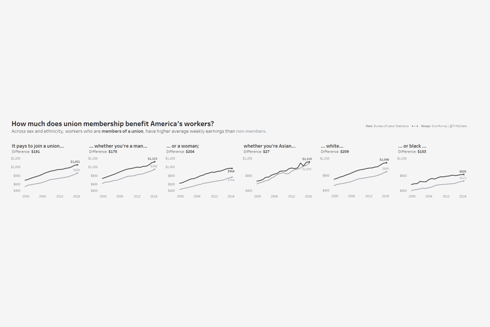
For week 49, Andy picked a dataset about union membership, from an article by Mona Chalabi, who writes for the Guardian and is a recognised journalist who uses data visualisation and data art to make information more accessible. I like Mona’s work and have read...
by Eva Murray | Aug 12, 2019 | Tableau
For week 33, Andy chose a fascinating dataset and topic which we were made aware of by Steve Wexler. Clinical trials for medical drugs are an interesting topic and one which I came across recently, but in the context of gender equality. At this point I want to...