by Eva Murray | Feb 11, 2020 | Makeover Monday, Tableau
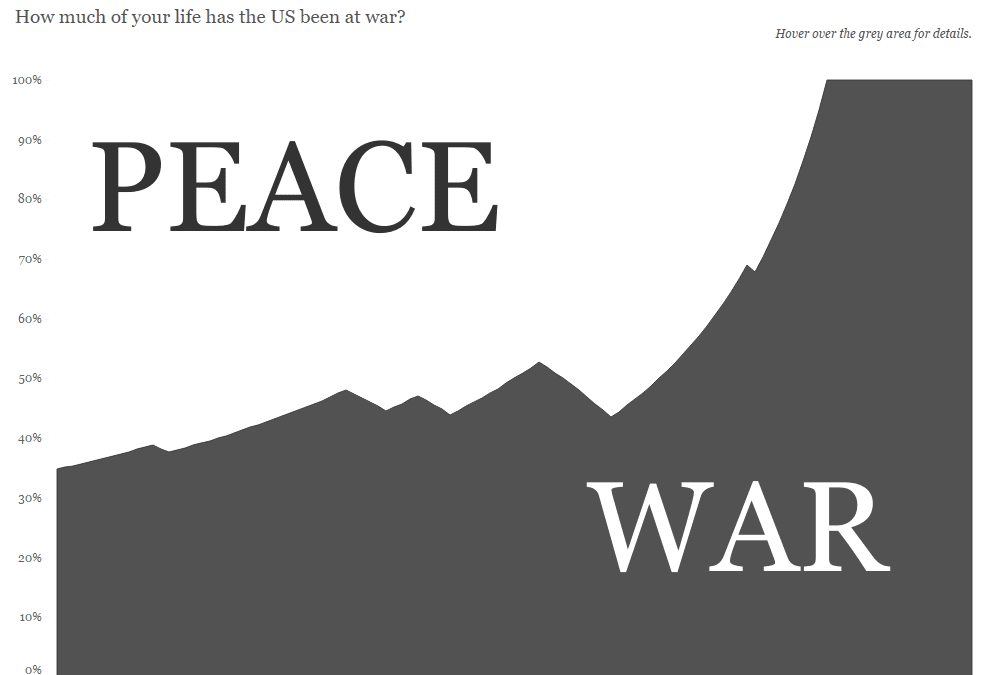
A few weeks ago, someone shared a viz from the Washington Post with me that showed how much of ‘your’ life the US has been at war, depending on someone’s year of birth. I thought this was a fascinating way to look at the data, so decided to challenge...