by Eva Murray | Jul 29, 2019 | Makeover Monday, Tableau
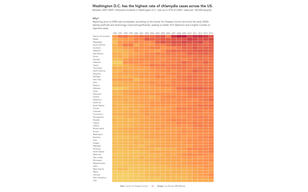
This week’s #MakeoverMonday takes us to one of Andy’s very first vizzes and one of the first vizzes published on Tableau Public (he published 8 vizzes the day the platform went live). We’re looking at STD infection rates in America and the original...
by Eva Murray | Jan 12, 2019 | Tableau
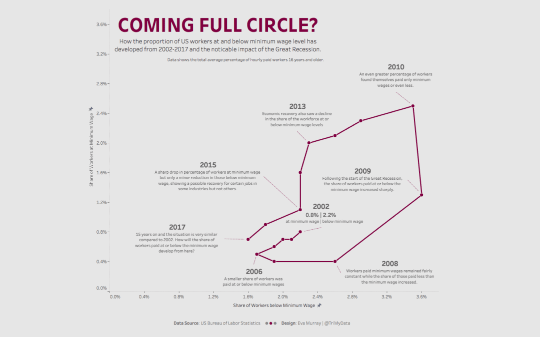
Week 3 is upon us and we’re moving from Freedom of the Press to minimum wages in the US. The viz to makeover this week is the following map showing for each stage the percentage of workers earning the minimum wage or less. What works well: A map is often a viz...
by Eva Murray | Jul 16, 2018 | Tableau
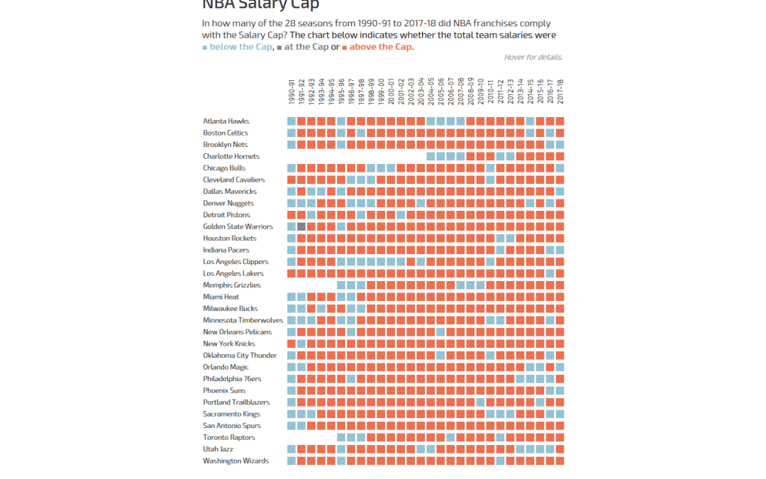
Andy actually did it: he pulled Basketball data on me! But hey, all good, we all have to occasionally work with data we know nothing about.The original viz comes from What’s the Cap? and shows a combined bar chart and line chart to indicate how high the salary...
by Eva Murray | Jun 10, 2018 | Tableau
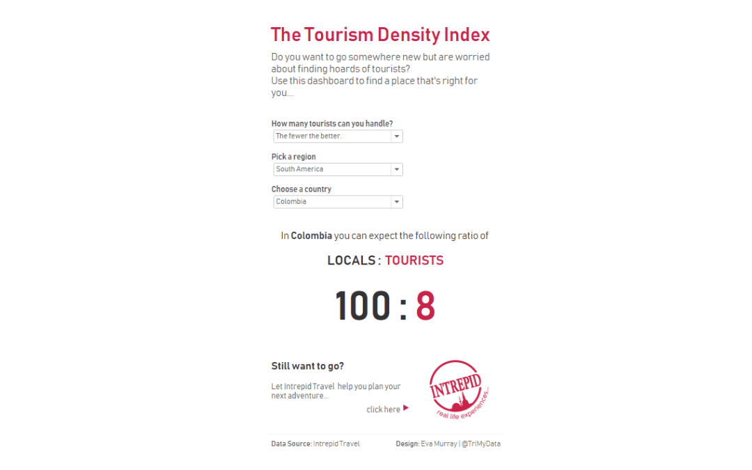
This dataset found its way to me through some sponsored content on an Australian news website recently and I thought the topic was really interesting. At the same time, the dataset is easy to understand yet provides plenty of opportunity for different angles,...
by Eva Murray | Jun 4, 2018 | Tableau
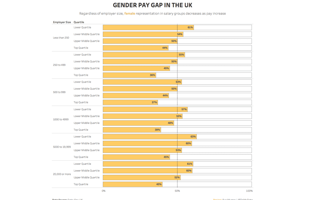
What a tough dataset Andy picked for this week. As much as I enjoy a good dig around the data, I do value my sleep and I’m missing out because I’m trying to make sense of this data.With a topic like the gender pay gap, it’s not like I’m happy...