by Eva Murray | Dec 30, 2018 | Tableau
And here we go again. Week 1 once more, now my third ‘week 1’ as a co-host of #MakeoverMonday. I’m very excited about the year ahead, finding new datasets and dataviz challenges for our community. Andy picked a dataset about NHL attendance, i.e. how...

by Eva Murray | Jul 16, 2018 | Tableau
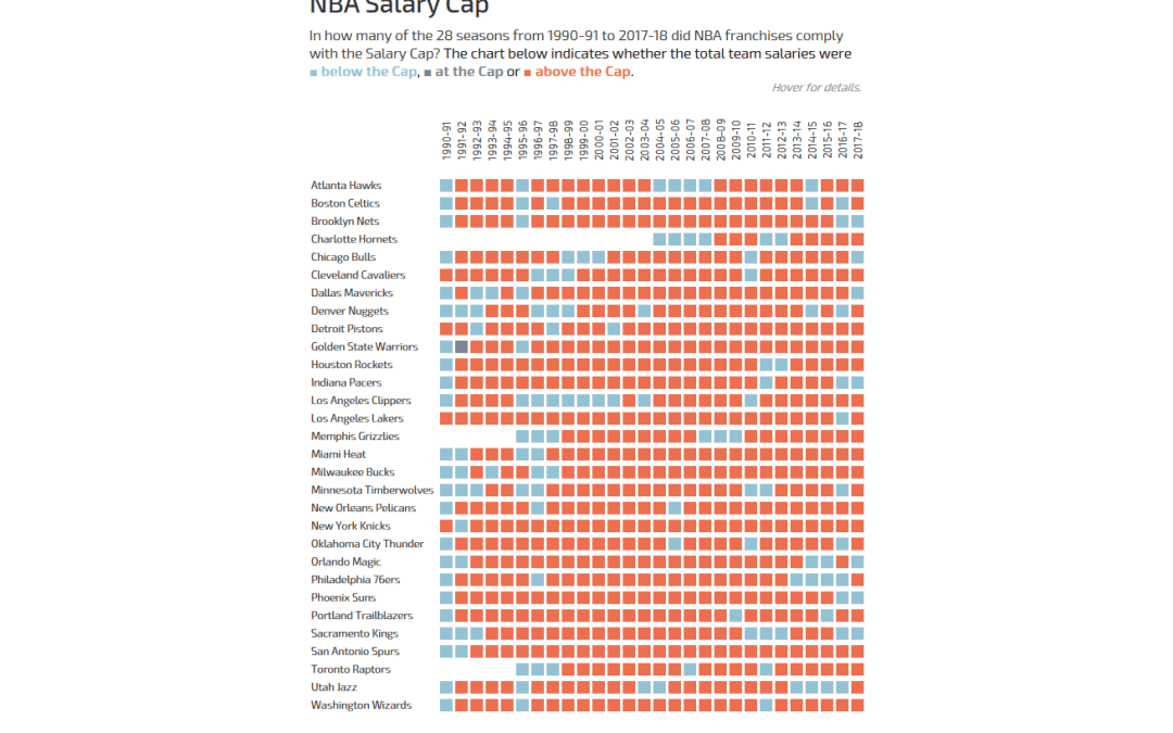
Andy actually did it: he pulled Basketball data on me! But hey, all good, we all have to occasionally work with data we know nothing about.The original viz comes from What’s the Cap? and shows a combined bar chart and line chart to indicate how high the salary...
by Eva Murray | May 7, 2018 | Tableau
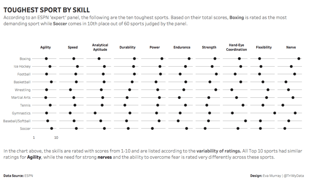
In this week’s dataset, the first thing I did was to sort the sports by Endurance and voila, distance cycling is on top. My faith in the world is restored and I can turn my attention to this week’s ESPN sports ranking by apparent...