by Eva Murray | Feb 24, 2020 | Makeover Monday, Tableau
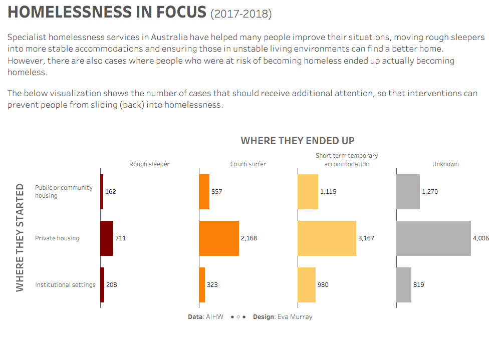
For week 8 I chose a dataset from the Australian Institute of Health and Welfare, looking at homelessness statistics and, more particularly, the outcomes of specialist homelessness services. The original visualization was published on AIHW’s website:...