by Eva Murray | Jul 16, 2018 | Tableau
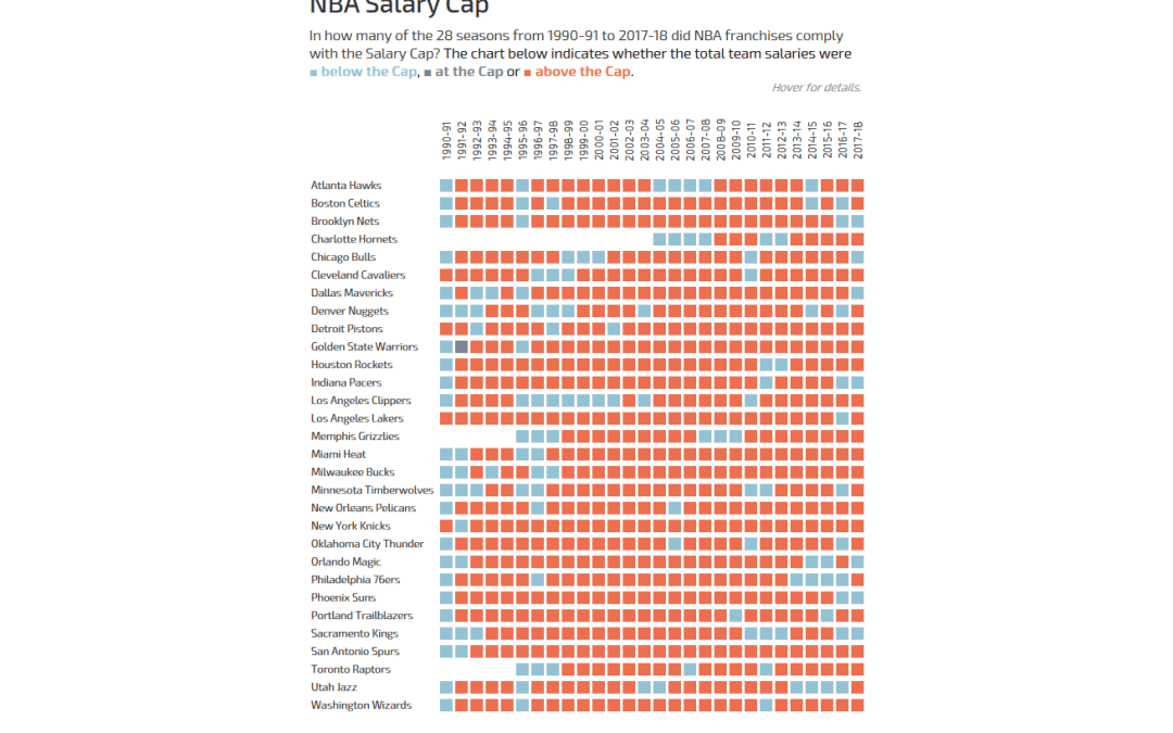
Andy actually did it: he pulled Basketball data on me! But hey, all good, we all have to occasionally work with data we know nothing about.The original viz comes from What’s the Cap? and shows a combined bar chart and line chart to indicate how high the salary...