by Eva Murray | Dec 9, 2020 | Makeover Monday, Tableau
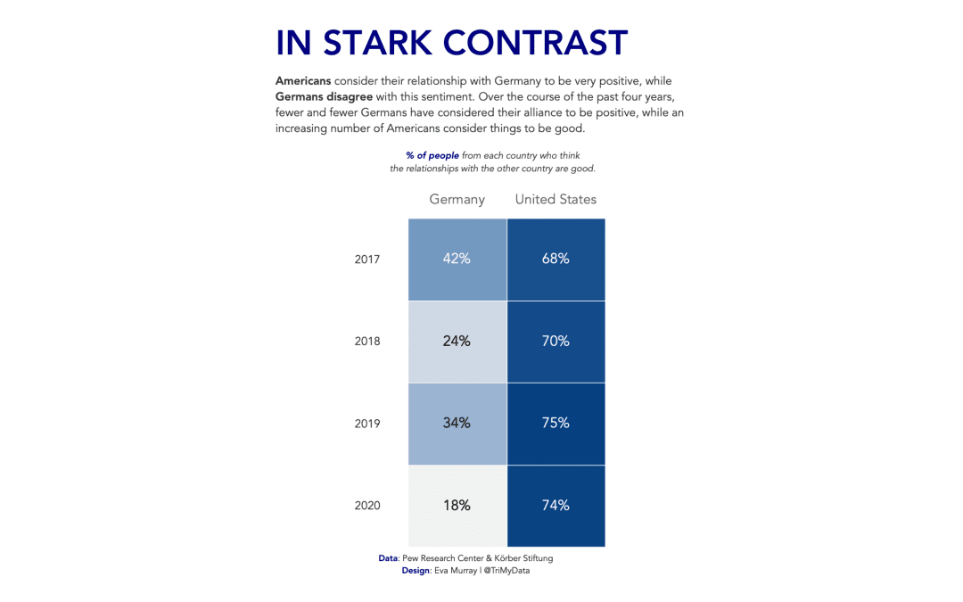
For this week Charlie picked an interesting topic: The perception among the population of how positive the relationship is between the US and Germany. The data came from a survey and the entire article can be found here. Here is the original visualization:...

by Eva Murray | Jul 28, 2020 | Tableau
This week sees us tackle another #Viz5 dataset, focusing on a gender equality topic: women in power, i.e. the parliamentary representation of women. The dataset comes from the World Bank and the team at Operation Fistula created a visualization for us to use as a...
by Eva Murray | Jan 20, 2020 | Makeover Monday, Tableau
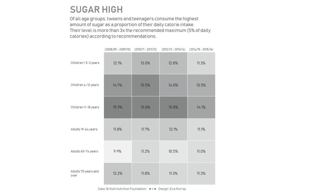
For week 3, Charlie picked an article and a viz about sugar and the high level of consumption of sugar in the UK by different age groups. Here is the original viz from the BBC:...
by Eva Murray | Jul 1, 2019 | Makeover Monday, Tableau
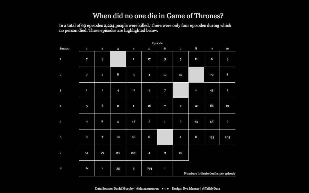
Somewhere in the middle of season 6 I stopped watching Game of Thrones and I never actually went back to it. I have to say I don’t miss it but I do understand why people are hooked to the series. This week for Makeover Monday we’re looking at deaths in GOT...
by Eva Murray | Apr 22, 2019 | Tableau
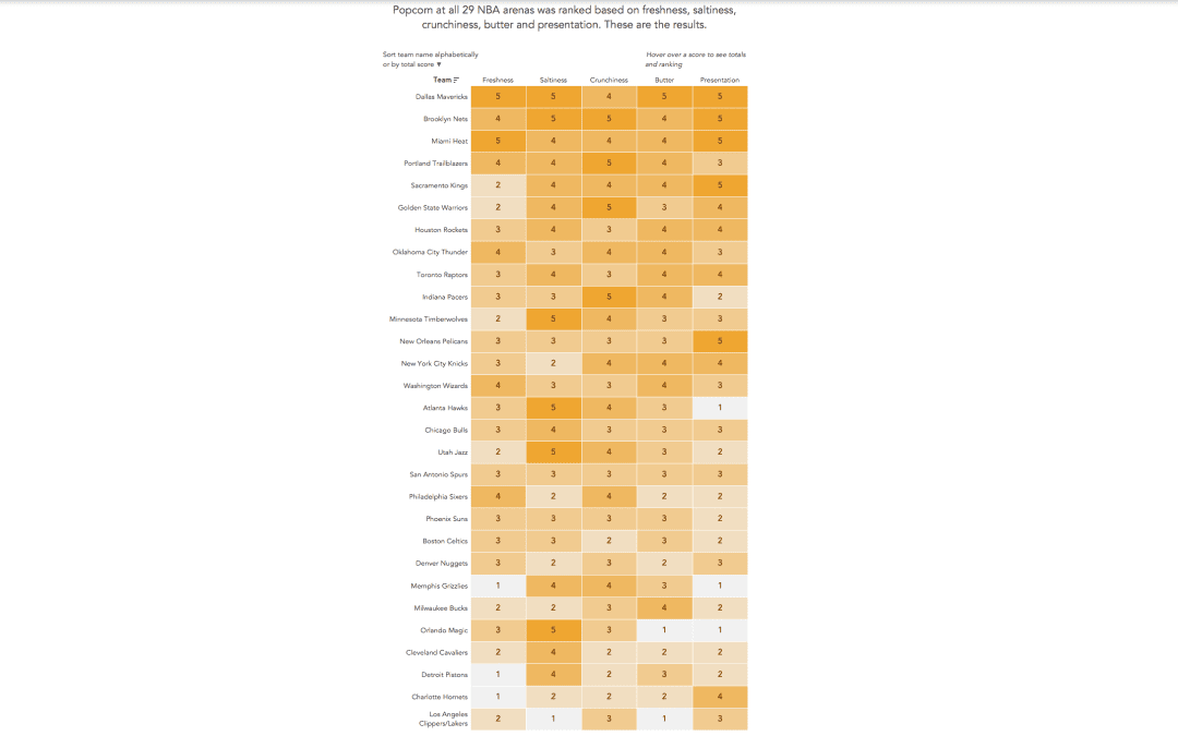
Andy found a great dataset for this week’s challenge: rankings of stadium popcorn at NBA stadiums across the US. It’s in an article by the New York Times and here is the viz itself: What works well: It’s a great viz of the ranking with clear labels...