by Eva Murray | Sep 1, 2019 | Tableau
September 1st is the first day of autumn, meteorologically speaking. So I picked a dataset about how Americans feel about the different seasons. The original viz and data comes from YouGov and looks like this: What works well: It’s a simple bar chart that is...
by Eva Murray | Jul 29, 2019 | Makeover Monday, Tableau
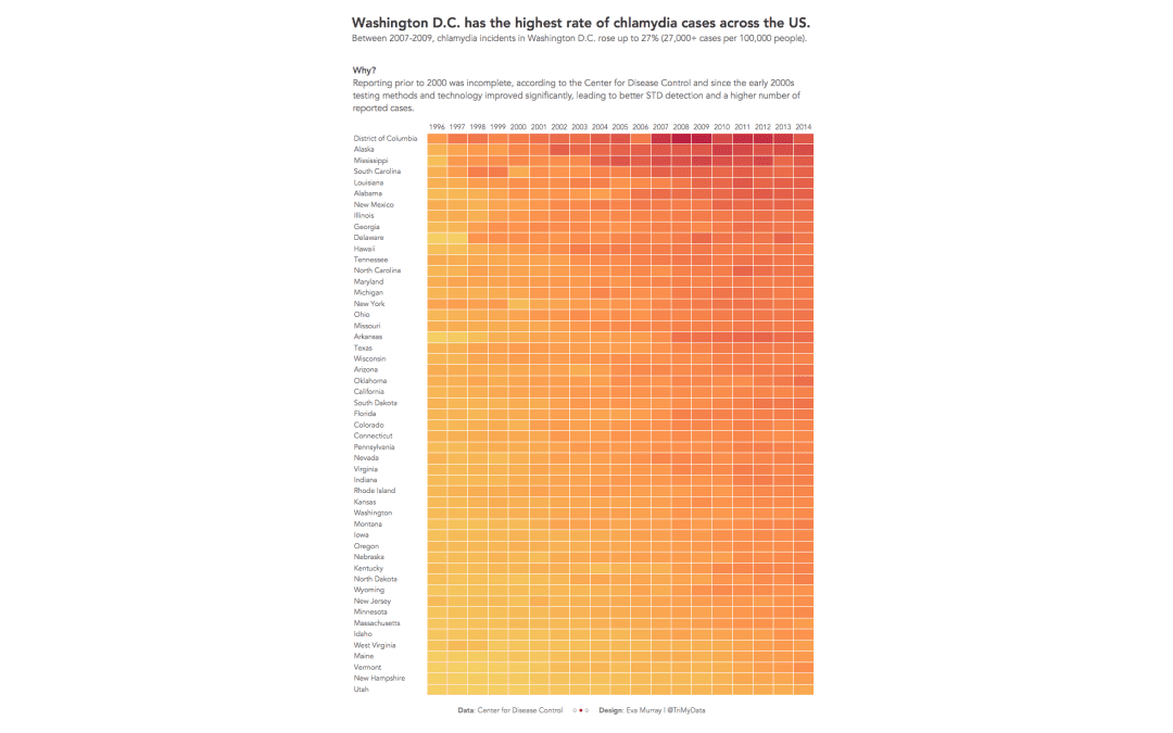
This week’s #MakeoverMonday takes us to one of Andy’s very first vizzes and one of the first vizzes published on Tableau Public (he published 8 vizzes the day the platform went live). We’re looking at STD infection rates in America and the original...
by Eva Murray | Jun 23, 2019 | Tableau
Alcohol seems to be involved in every major celebration but equally in a typical Friday afternoon and for #MakeoverMonday in this week we’ll look at alcohol consumption. Here is the original viz: What works well: A simple bar chart, sorted in descending order...
by Eva Murray | Jun 2, 2019 | Tableau
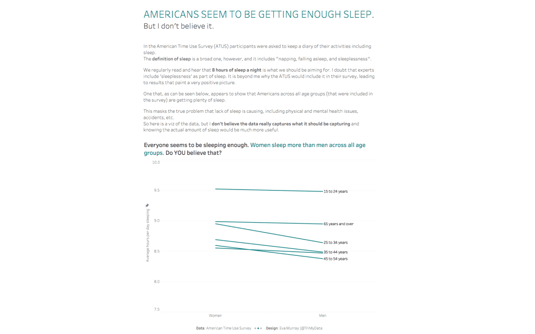
We’re continuing to tackle important topics with #MakeoverMonday and I really enjoy it. I’ve noticed the community putting in the extra effort when a dataset ‘matters’ from a societal, political, environmental or ethical perspective. So for...
by Eva Murray | May 13, 2019 | Tableau
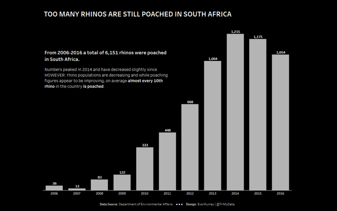
After a few weeks of more in-depth datasets I decided to use a dataset that was shorter and simpler, with the option for people to add more context should they wish to do so. This week we’re looking at rhino poaching in South Africa and the original viz looks...