
Nudges, Ideas and a sprinkle of career advice
This is where you’ll read from me. It’s a mix of nudges that encourage you to take the next bold step, ideas that help you make a change and advice so you can avoid the mistakes I made along the way.
From my keyboard to you. No ChatGPT involved, just a bunch of honest writing, usually done in the morning hours before the world wakes up.
I hope you enjoy it and I’d love to hear from you, so feel free to comment on these posts.
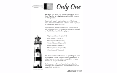
#MakeoverMonday 2020 Week 50: A Statistical Analysis of the Work of Bob Ross
This week’s dataset is all about the work of Bob Ross and the elements in his paintings and the frequency with which they appear. I focused on those elements that hardly ever got painted…
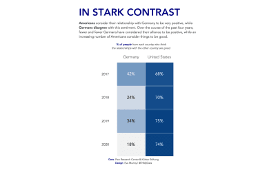
#MakeoverMonday 2020 Week 49: Transatlantic Alliance
Analyzing the transatlantic relationships between the US and Germany via a heatmap.
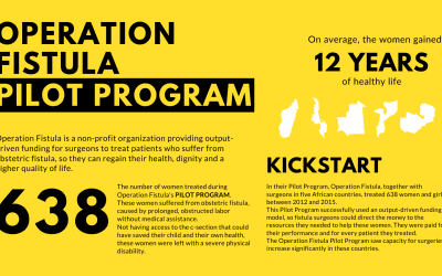
#MakeoverMonday 2020 Week 48: The success of Operation Fistula’s Pilot Program
For this week’s #Viz5 dataset I created an infographic in Canva, following analysis in Tableau. I used a long-form layout and was inspired by the colors of Operation Fistula’s latest social media campaign.

#MakeoverMonday 2020 Week 47: Why America’s debt doesn’t stop growing
This week we tackle data about the US economy, with a visualization from the Visual Capitalist.
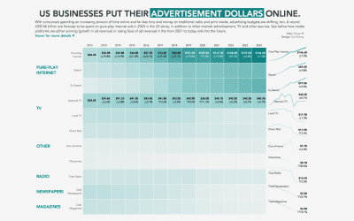
#MakeoverMonday 2020 Week 46: The Majority of Advertising Dollars are Now Being Spent Online
This week I create a heat map to show changes over time, supported by sparklines and specific labelling.
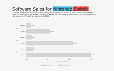
#MakeoverMonday 2020 Week 45: Dedicated Video Game Sales Units
A quick and simple viz from me this week for video game sales numbers for Nintendo Switch (hardware and software).
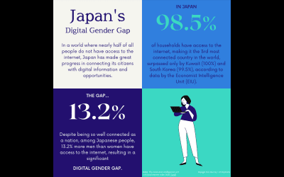
#MakeoverMonday 2020 Week 44: #Viz5 – The Digital Gender Gap
I experimented with Canva this week to create a simple design after doing the data analysis in Tableau. I quite like this approach for small datasets and focused data stories that don’t require interactivity.
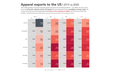
#MakeoverMonday 2020 Week 43: Apparel Exports to the US
For this week’s #MakeoverMonday, Charlie chose a dataset about the unpaid apparel orders by US brands from their producers, resulting in severe detrimental impacts on workers rights and businesses.
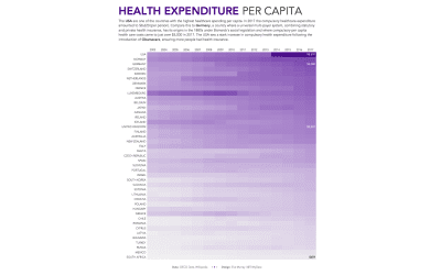
#MakeoverMonday 2020 Week 42: Health spending
For week 42 I created a heat map to show health spending in different countries over time. The US certainly stand out on a per capita basis.
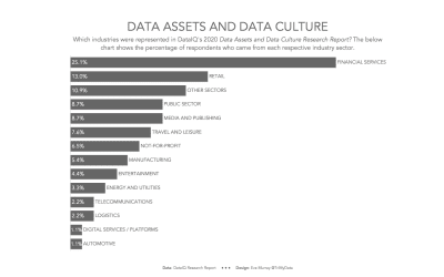
#MakeoverMonday 2020 Week 41: Data assets and data culture
This week’s dataviz challenge takes a terrible chart that communicates nothing and turns it into something that’s easy to understand.
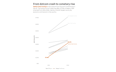
#MakeoverMonday 2020 Week 40: The U.S. Counties With the Highest Economic Output
This week’s #MakeoverMonday is a very simple chart in Tableau that I created during our #MMLIVE event to kick off the week of #data20.

#MakeoverMonday 2020 Week 39 – #Viz5: Child Marriage
This week I use Tableau and Canva to create an infographic style visualization focusing on the worst data point: almost 30% of girls in Chad are married by the age of 15.