Nudges, Ideas and a sprinkle of career advice
This is where you’ll read from me. It’s a mix of nudges that encourage you to take the next bold step, ideas that help you make a change and advice so you can avoid the mistakes I made along the way.
From my keyboard to you. No ChatGPT involved, just a bunch of honest writing, usually done in the morning hours before the world wakes up.
I hope you enjoy it and I’d love to hear from you, so feel free to comment on these posts.
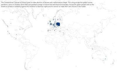
#MakeoverMonday Week 8 2021: Protests Against Limiting Abortion Rights in Poland
This week brings a challenging topic. One that requires all of us to slow down a bit rather than rush to work with the data. Topics that are polarising and/or taboo in society give us analysts an extra bit of responsibility treat the data carefully, check our assumptions and conclusions and be mindful of the wording we use to draw attention to a topic.
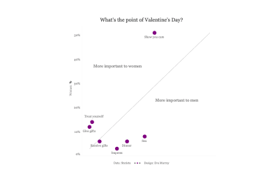
#MakeoverMonday Week 7 2021: What’s the point of Valentine’s Day?
Not a big fan of Valentine’s Day myself but this dataset was amusing to go through. It’s interesting how men and women see the purpose of Valentine’s Day so differently!
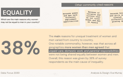
#MakeoverMonday Week 6 2021: Perceived Obstacles to Gender Equality
In all countries women more than men consider the burden of domestic duties and responsibilities to have more of a detrimental effect on equality.
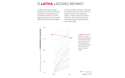
#MakeoverMonday Week 5 2021: Renewables Overtake Fossil Fuels in Europe
Looking at different countries and comparing their numbers I noticed that among all EU27 countries, Latvia was the only one where production from renewables decreased since 2000, while all other countries went to increase their production from renewables.
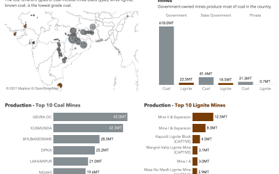
#MakeoverMonday Week 4 2021: Indian Coal Mine Production
A visualization of data about Indian coal mines and their production outputs.
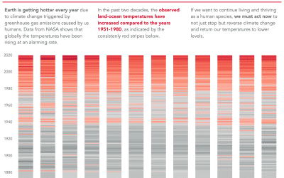
#MakeoverMonday Week 3 2021: What’s Warming The Earth?
This week I created a bar chart that shows that temperatures have risen progressively over the past few decades.
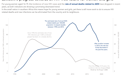
#MakeoverMonday Week 2 2021:
For this #Viz5 challenge I focused on Eswatini and the hopeful trends related to HIV infections and AIDS related deaths in the small African nation.
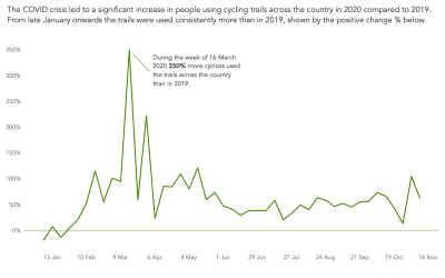
#MakeoverMonday Week 1 2021: The Great Bicycle Boom of 2020
As we turn over the calendar to 2021, we also kick off another year of #MakeoverMonday. This week’s visualization challenge is about the trail usage of people in the US, measured through observational data in outdoor areas where trails provide access to nature for people across the country.
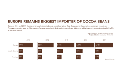
#MakeoverMonday 2020 Week 52: Global Cocoa Imports
The last #MakeoverMonday of 2020 is about cocoa imports by Europe, Asia & Oceania and the Americas. Check out the bar chart I created as a makeover to address the shortcomings of the original.
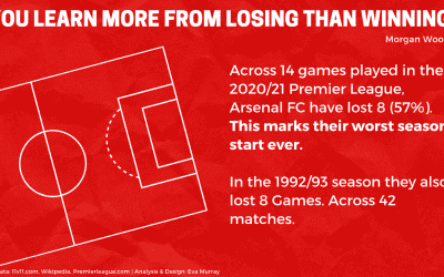
#MakeoverMonday 2020 Week 51: Arsenal’s worst ever Premier League start
This week’s design comes from Canva with analysis done in Tableau to show the poor performance of Arsenal FC in the current Premier League season 2020/21
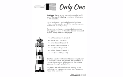
#MakeoverMonday 2020 Week 50: A Statistical Analysis of the Work of Bob Ross
This week’s dataset is all about the work of Bob Ross and the elements in his paintings and the frequency with which they appear. I focused on those elements that hardly ever got painted…
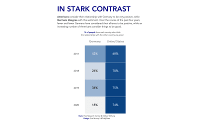
#MakeoverMonday 2020 Week 49: Transatlantic Alliance
Analyzing the transatlantic relationships between the US and Germany via a heatmap.