by Eva Murray | Mar 17, 2019 | Makeover Monday, Tableau
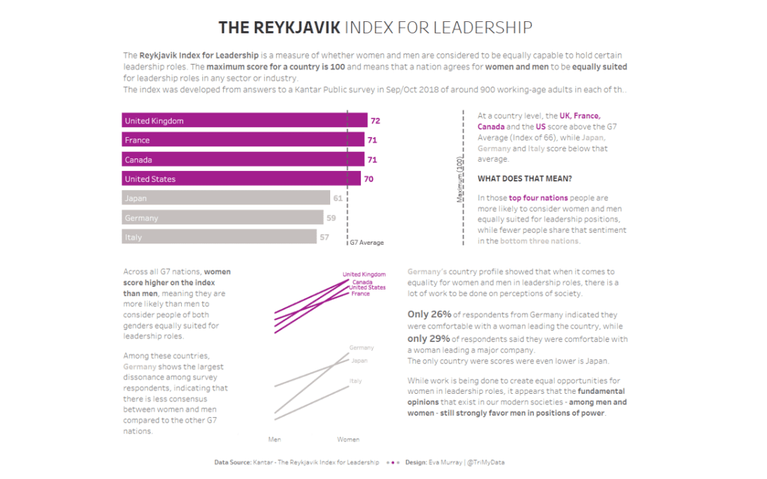
Following International Women’s Day in on 8thMarch, I decided to continue with a women and equality related dataset for thismonth. A few weeks ago, I came across an interesting viz that was part of anarticle about women in leadership roles and whether men and women...
by Eva Murray | Mar 11, 2019 | Tableau
Week 11 marks the first week of me running #MakeoverMonday as a quasi solo act. Andy is taking a well deserved break from the community engagement of this project because recent actions but a few people have really spoiled the fun. I do fully support his decision and...
by Eva Murray | Mar 3, 2019 | Makeover Monday, Tableau
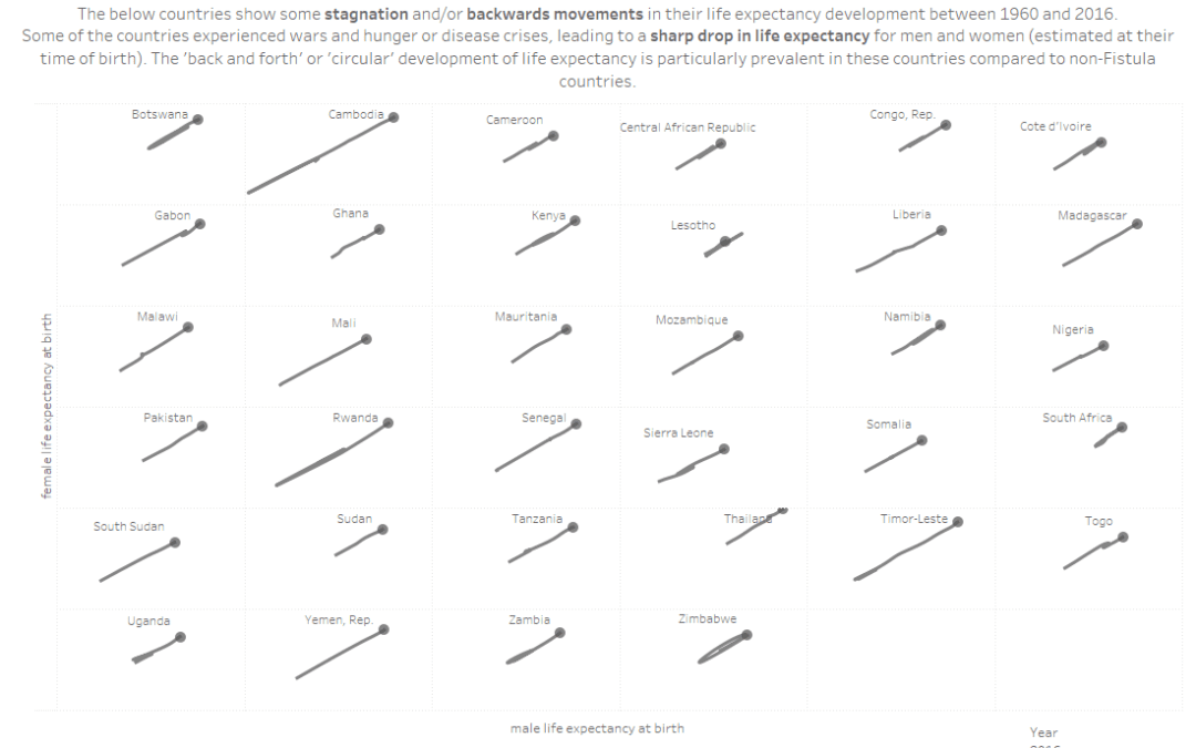
For week 10 we are collaborating with the team at Operation Fistula to support their mission and to bring more visibility and awareness to the issue of obstetric fistula (‘the worst thing you’ve never heard of’). The dataset is large in terms of...
by Eva Murray | Feb 25, 2019 | Makeover Monday, Tableau
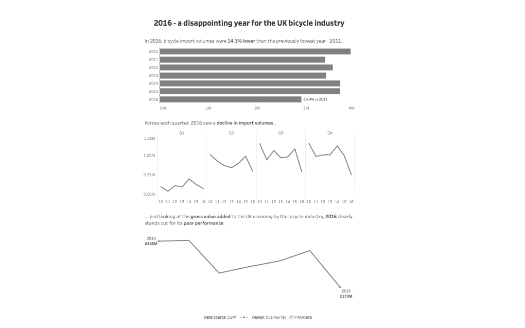
For this week’s MakeoverMonday challenge, we look at data about bicycle imports to the UK from 2010 – 2016. The original viz comes from a report by SQW and looks like this: What works well: Using a line chart for time series data Showing quarterly data...
by Eva Murray | Feb 17, 2019 | Makeover Monday, Tableau
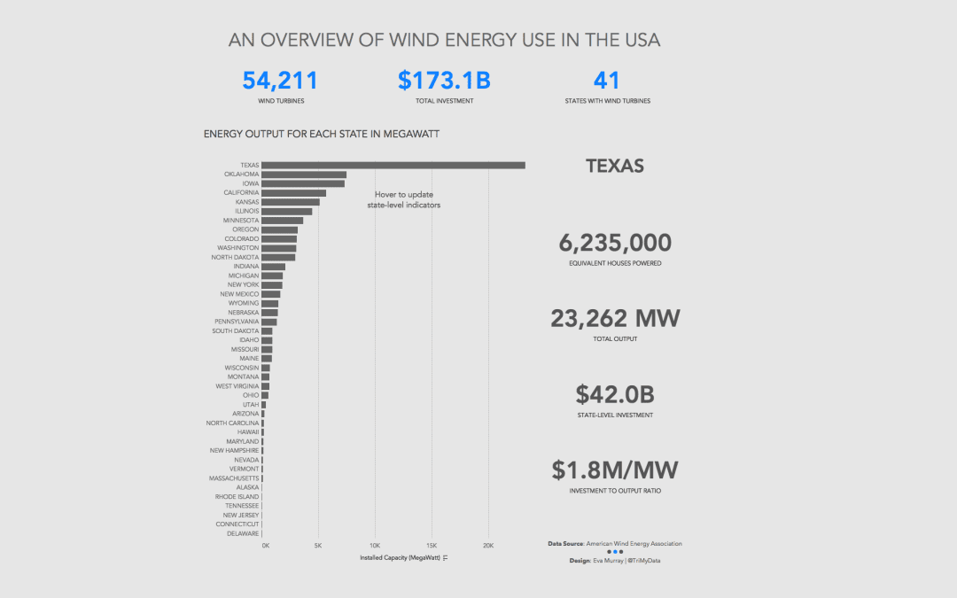
This week we look at how much wind energy is produced in different US states. The original viz (and awfully opinionated, anti-wind energy article) comes from howmuch.net: What works well: States are sorted in descending order from highest to lowest installed capacity...