by Eva Murray | May 22, 2019 | Tableau
For this week Andy chose a dataset about bear attacks that ended fatally. The original viz comes from Vox: What works well: Nice simple viz Bar chart is easy to read Showing clearly the months when no fatalities occured Clear title and subtitle What could be improved:...

by Eva Murray | May 13, 2019 | Tableau
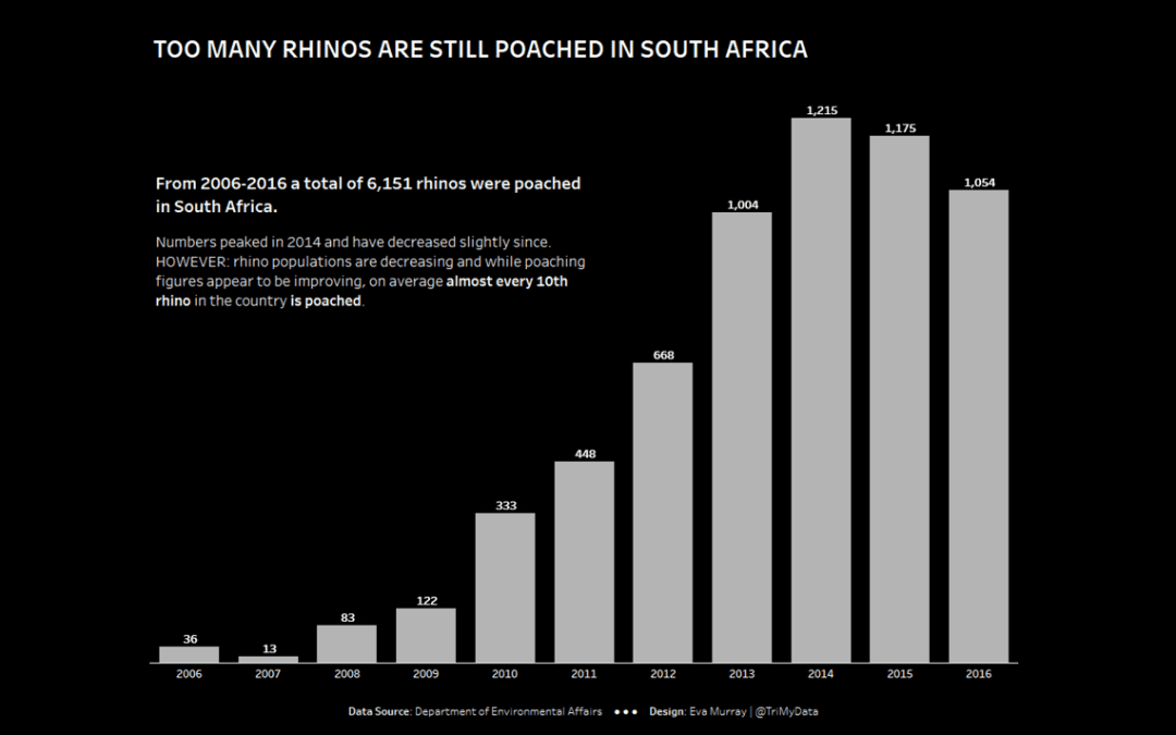
After a few weeks of more in-depth datasets I decided to use a dataset that was shorter and simpler, with the option for people to add more context should they wish to do so. This week we’re looking at rhino poaching in South Africa and the original viz looks...
by Eva Murray | May 6, 2019 | Tableau
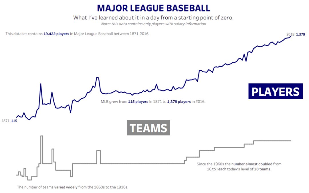
For week 19 Andy picked baseball data and I’ll be the first to admit that I expected it to not be fun, because it’s a topic I know nothing about and I wasn’t quite ready to spend hours learning about baseball. Until I did. Here is the original viz:...
by Eva Murray | Apr 30, 2019 | Makeover Monday, Tableau
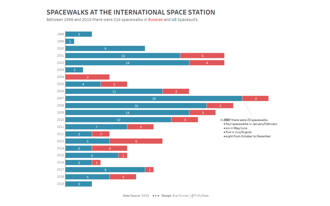
When I came across a dataset about spacewalks at the International Space Station, I knew I had to use it for Makeover Monday, especially because there were so many awesome vizzes from a previous NASA dataset about solar eclipses. Here is the original viz: What works...
by Eva Murray | Apr 22, 2019 | Tableau
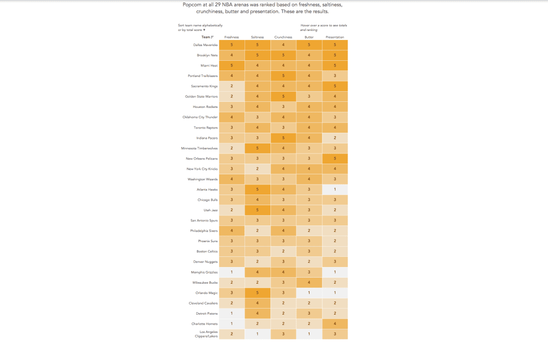
Andy found a great dataset for this week’s challenge: rankings of stadium popcorn at NBA stadiums across the US. It’s in an article by the New York Times and here is the viz itself: What works well: It’s a great viz of the ranking with clear labels...