by Eva Murray | Dec 2, 2019 | Makeover Monday, Tableau
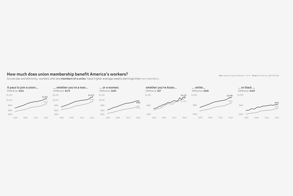
For week 49, Andy picked a dataset about union membership, from an article by Mona Chalabi, who writes for the Guardian and is a recognised journalist who uses data visualisation and data art to make information more accessible. I like Mona’s work and have read...
by Eva Murray | Nov 27, 2019 | Makeover Monday, Tableau
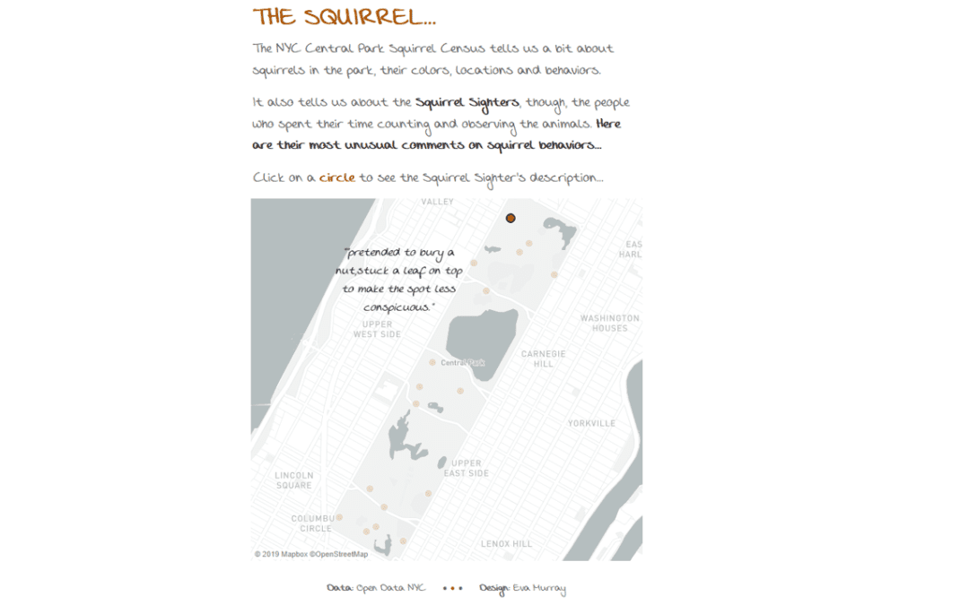
Since moving to London, squirrels have become my favourite sight. Maybe even my favourite animal. Horses dominated that rank for 34 years but squirrels are everywhere here, especially around the property where I live. And they are really cute, really fluffy and always...
by Eva Murray | Nov 18, 2019 | Tableau
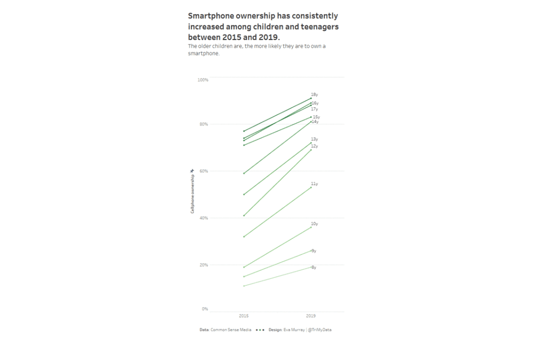
Given the buzz of #data19 last week, we’re working with a small and simple dataset for week 47, so we can all have some extra time to catch up on the things we missed at home. Here is the original viz: What works well: The colors draw my attention. The line...
by Eva Murray | Nov 17, 2019 | Life stuff, Tableau
As I type this, I’m into the last 2 hours of my flight home from Las Vegas, having spent six days there for #data19, Tableau’s annual conference. Talking to some of my old and new friends and reflecting onthe week in Vegas made me think there is a need for a little...
by Eva Murray | Nov 12, 2019 | Tableau
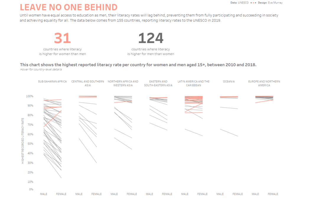
#data19 has arrived and with it a live #MakeoverMonday session with A LOT of people. We want to use that opportunity of getting everyone in a room with their ideas and skills to tackle a topic that is very relevant today. Literacy and how literacy rates differ across...