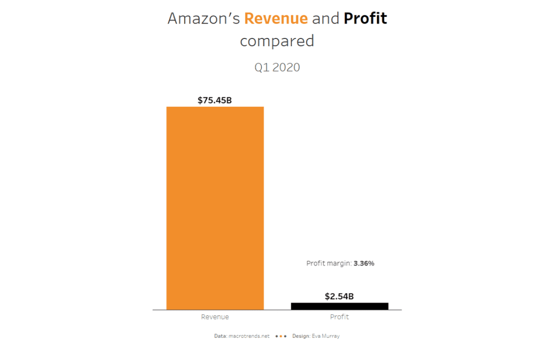
by Eva Murray | Jun 24, 2020 | Makeover Monday, Tableau
Fos this week’s #MakeoverMonday challenge, Charlie picked a chart about Amazon’s revenue vs profit from this article. What works well: It’s a very simple and clean line chart that is easy to read and understand. The title is clear and succinct. The...
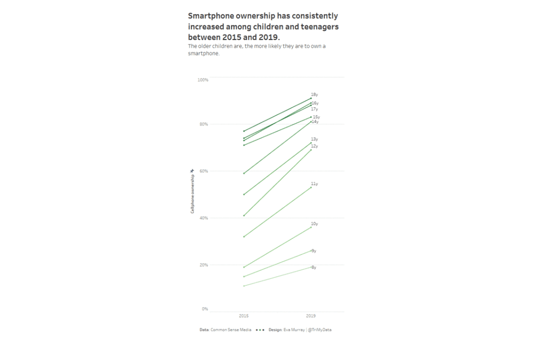
by Eva Murray | Jun 19, 2020 | Makeover Monday, Tableau
In #MakeoverMonday we naturally mix heavier topics with some lighter and easier ones. We also aim to have a good variety of datasets so participants can work with complex, simple, large and small amounts of data, using different visualization and analysis approaches....
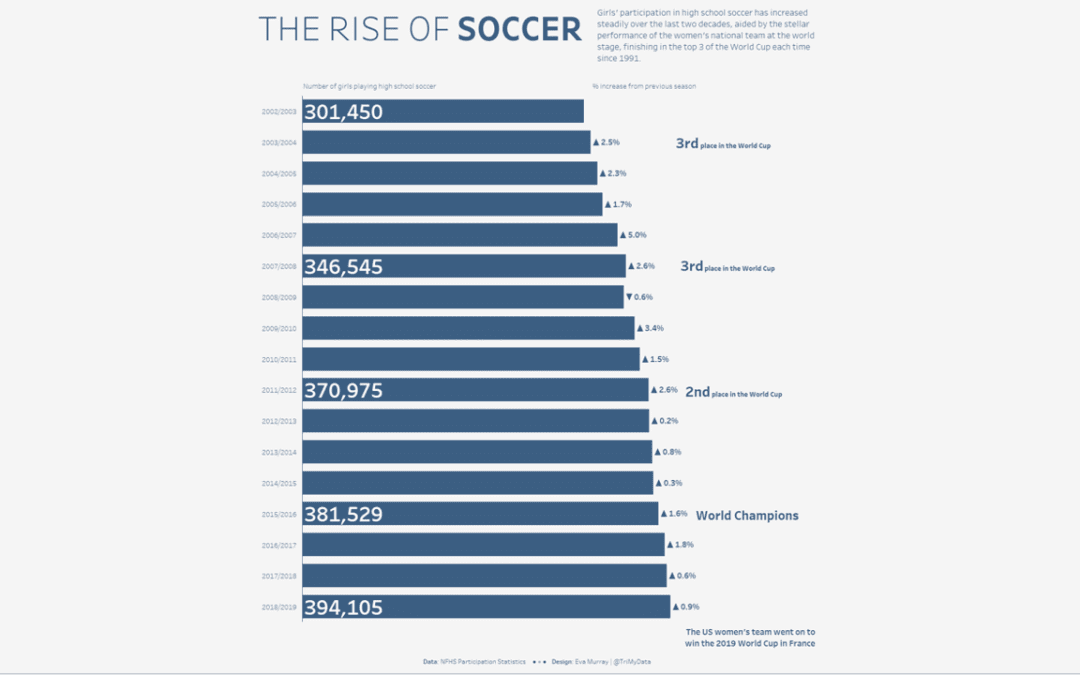
by Eva Murray | Jan 6, 2020 | Tableau
For his first dataset, Charlie picked the topic of how popular different American sports are with spectators. Here is the original viz from Vox.com What works well: A nice and simple chart Lines are labeled I like the focus on the top 3 Colors are easy to...
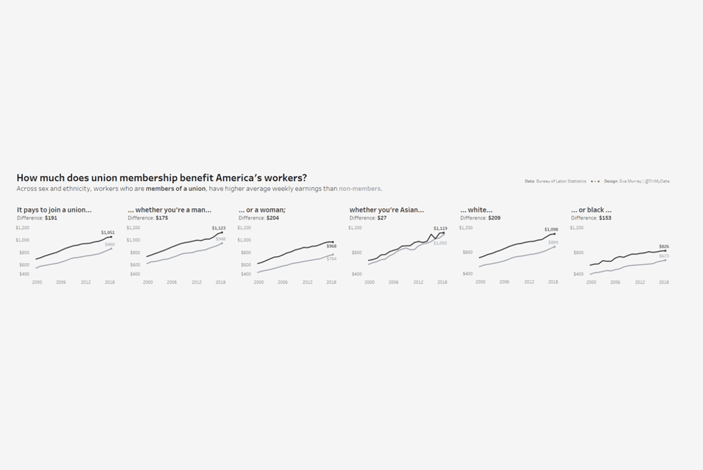
by Eva Murray | Dec 2, 2019 | Makeover Monday, Tableau
For week 49, Andy picked a dataset about union membership, from an article by Mona Chalabi, who writes for the Guardian and is a recognised journalist who uses data visualisation and data art to make information more accessible. I like Mona’s work and have read...
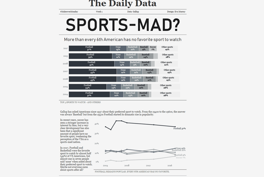
by Eva Murray | Nov 18, 2019 | Tableau
Given the buzz of #data19 last week, we’re working with a small and simple dataset for week 47, so we can all have some extra time to catch up on the things we missed at home. Here is the original viz: What works well: The colors draw my attention. The line...