by Eva Murray | Mar 21, 2021 | Uncategorized
I enjoy random topics like the one Andy picked for this week: What did 2020 look like for the cereal industry and what does the data suggest about our cereal consumption habits? (or at least those of people in the US?Here is the original visualization, published on...
by Eva Murray | Mar 14, 2021 | Uncategorized
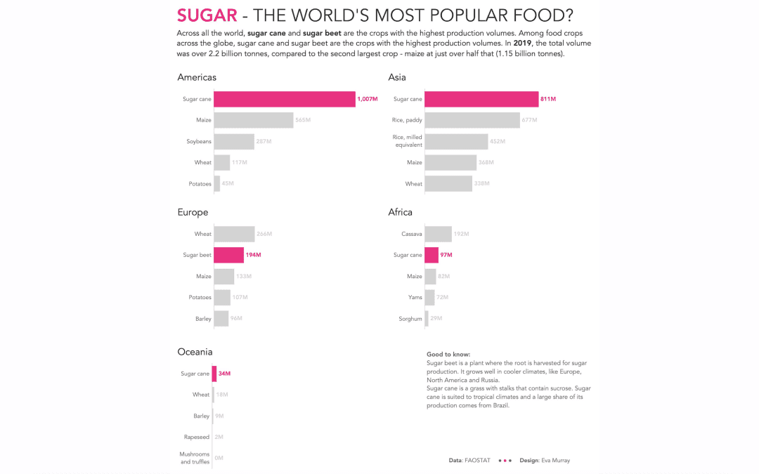
The visualizations we use for #MakeoverMonday are usually in need of a makeover but sometimes we use visuals that are already really good, and they cover an interesting topic or really good dataset.This week we’re looking at crops – what’s grown, how efficient...
by Eva Murray | Feb 15, 2021 | Makeover Monday, Tableau
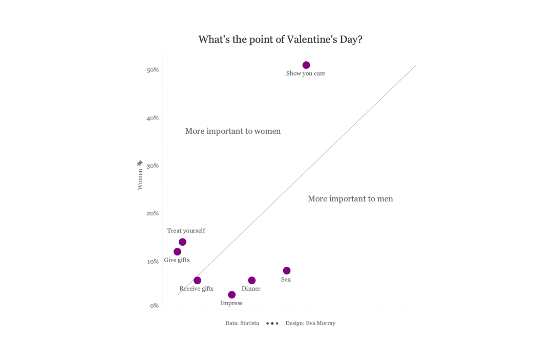
When our data upload day falls on Valentine’s Day, it makes for a very obvious choice of topics. So this year for #MakeoverMonday week 7 we’re looking at survey data about Valentine’s Day and the perception people have of the purpose of the day. The...
by Eva Murray | Jan 28, 2021 | Makeover Monday, Tableau
This year for #MakeoverMonday we made a change and now Andy is in charge of ALL the data while I’m in charge of the entire feedback process. We both get to do the things we enjoy the most and one benefit for me is that I don’t know what’s coming each...
by Eva Murray | Jan 21, 2021 | Makeover Monday, Tableau
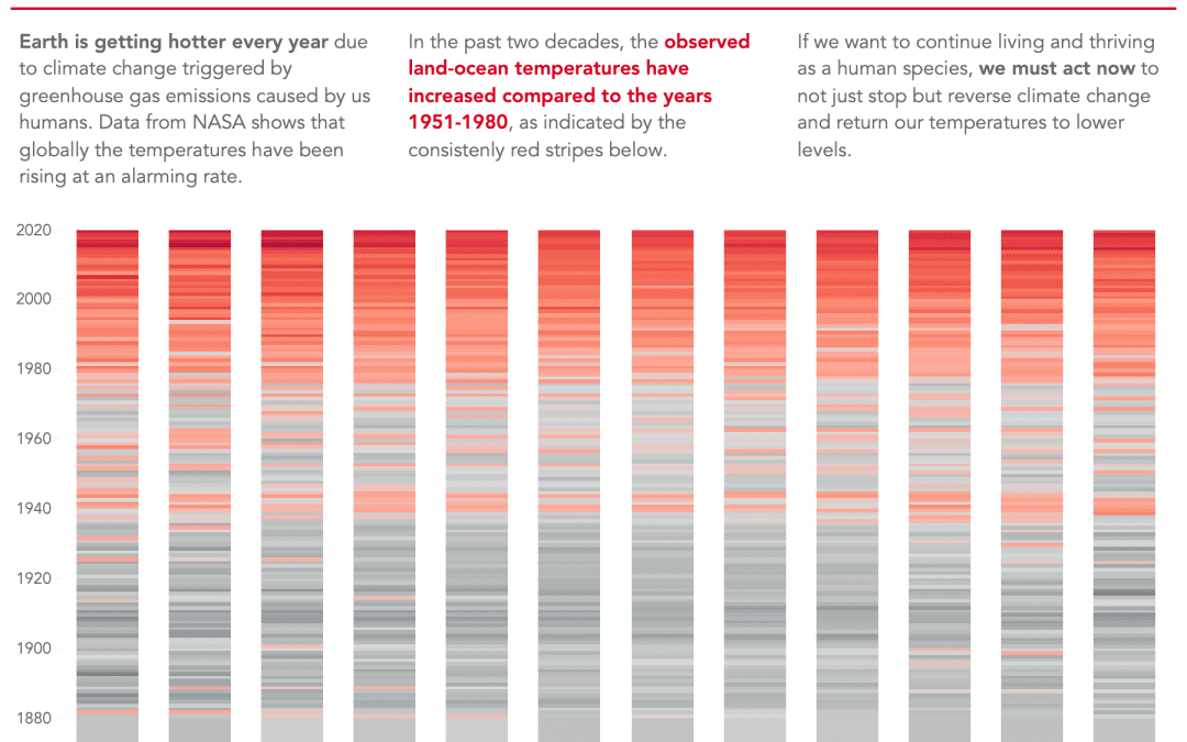
For this week Andy chose a dataset about global warming, a topic that has been largely ignored in the media during 2020 as everyone’s focus shifted to the COVID pandemic. But here we are, getting closer and closer to the point where irreparable damages will be...