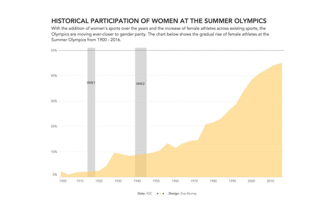
Continuing the theme of gender equality with a focus on topics about women and their situation as it relates to different aspects of life, society, politics, etc., this week’s focus is on participation in the Olympic Games.
The original viz comes from swimswam.com and looks like this:
What works well:
-
Showing time series data with a line chart is usually the best (or one of the best) ways to present such data.
-
The percentage labels on the axis show how close we are to parity (50:50).
-
Simple colors, no unnecessary chart junk
What could be improved:
-
Where is the title?
-
Women vs. ???
-
What are the gaps in the line (they are WW1 and WW2 but this should be pointed out.
-
Do we need decimal points on the axis label?
What I did:
-
I focused on women’s participation in the Summer Olympics with a simple area chart.


