Andy found a great viz for this week’s #MakeoverMonday challenge and kindly dug out the data for me as well as I’m managing a few different projects at the same time.
This week we’re looking at advertising spend in the US with the original viz looking like this:

What works well:
- The colors overall are nice, even if some are too similar
- The viz looks engaging
- I like the dotted line from 2020 to 2024 to indicate the future projections
- Nice big numbers for labels
What could be improved:
- The purples are too similar and hard to differentiate
- Sizing the numbers by ad spend makes the viz looks a bit busy
- The title gets lost because the font is quite small
- The timeline (x-axis) is too prominent and looks out of balance with the rest of the viz
What I did:
- This week I wanted to play with labels and label formatting. I like labels, they need more attention.
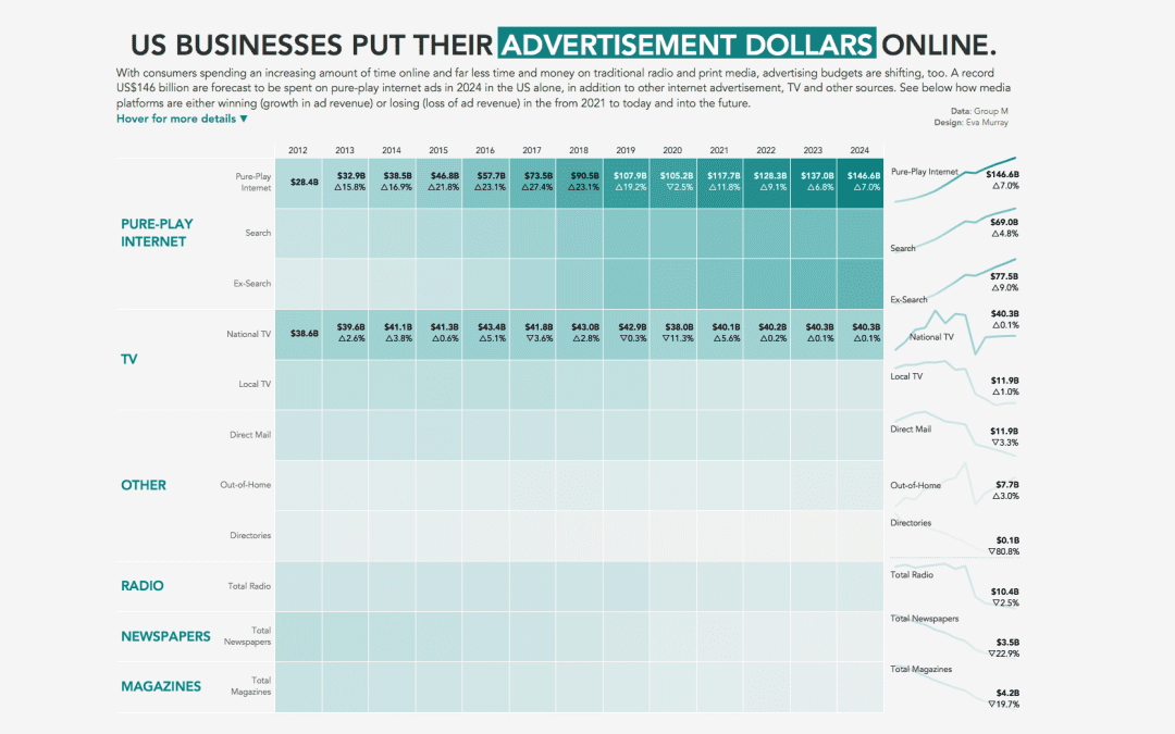
- I decided on a heat map in an effort to show the change over time and the drastic change in internet ad spend versus all the others. I sorted the categories and items accordingly.
- I’m actually happy with how this turned out this week. Click on the image for the interactive version with tooltips and hover actions.
