This has to be a quick post, so here we go:
The original viz:
What works well:
- It looks engaging.
- The topic is simple, so the title is sufficient and the labels on the stacked bar chart help me understand it.
- Source is included.
What could be improved:
- Benefits in the title is underlined in the same yellow as ‘working from home’ – not sure if this is deliberate?
- the picture is very prominent, the data should be the focus
What I did:
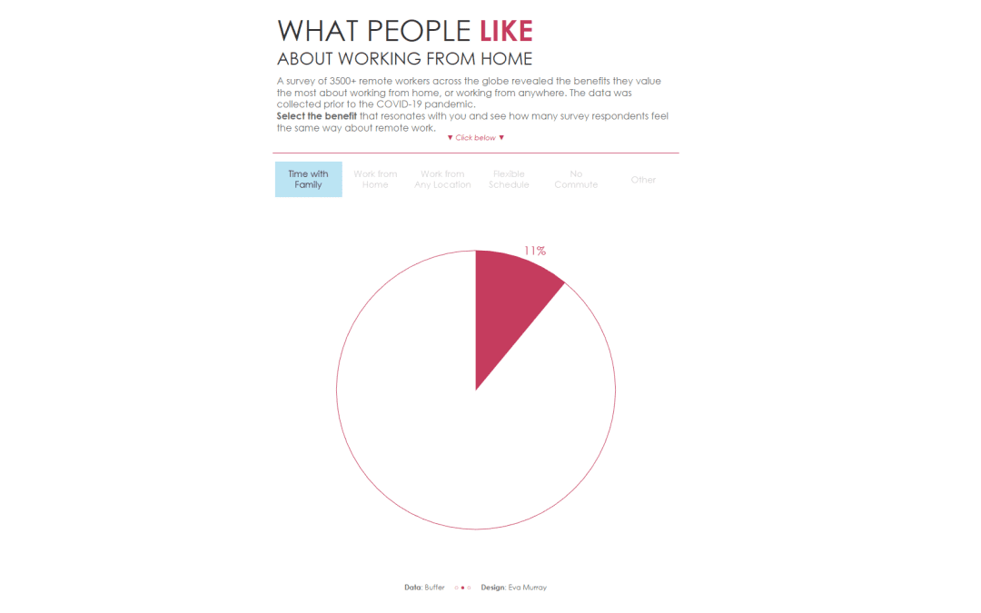
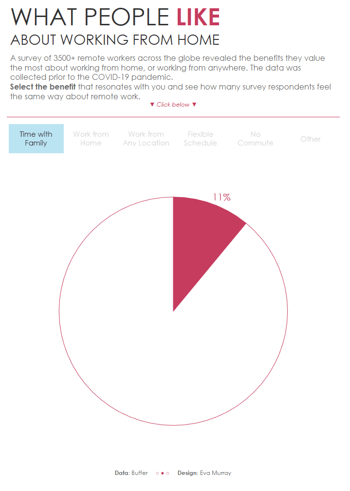
- A pie chart where you can choose your own adventure.
- I wanted to add additonal functionality but ran out of time.
- click on the image to view the interactive version


