This week we launched the Visualize Gender Equality campaign #Viz5 and we are starting with a heavy topic: violence against women and girls and the perception of women and men towards violence being justified.
I am excited about the year-long collaboration with Operation Fistula which will see us tackle a different gender equality topic every month.
Here is the original viz:
What works well:
- There is a lot of contextual information on the page, which helps people understand the data better. This being no trivial topic means that care needs to be taken to ensure the data is communicated the right way. Using context in this way is helpful and something I always recommend.
- Minimal use of colour reduces the potential for distraction
- Simple bar charts are used to show the data.
What could be improved:
- Data is averaged across countries, which is a bad idea given that sample sizes in each country differ. By averaging the numbers the results are inaccurate
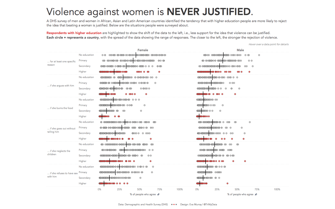
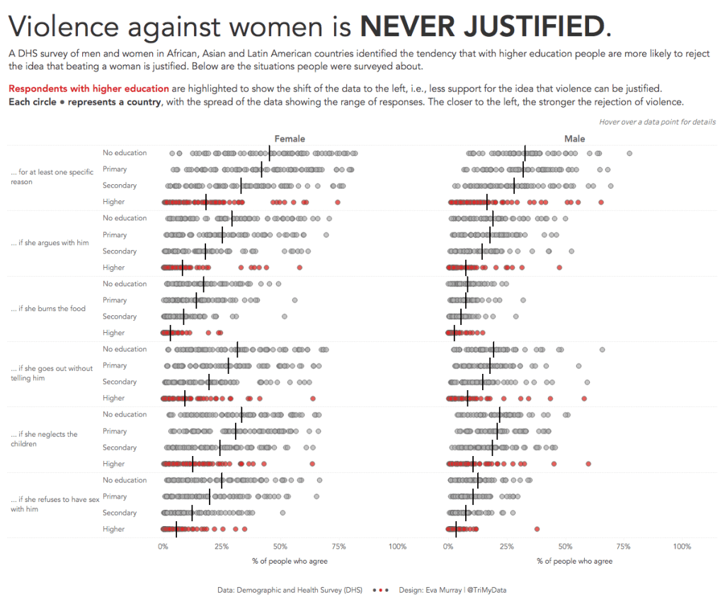
- While education seems to be the key driver for changing attitudes, this statement in the title does not come out very clearly in the data.
What I did:
- It took me three days of tinkering to get to a result I was comfortable with. The original was a ‘formatting makeover’ I did of the actual original viz and I realised when now working properly with the data, how complex the dataset was and how difficult it is to actually get the message across. Kudos to everyone who participated and wrapped their heads around getting this onto a single page somehow.
- I tried a few different approaches and in the end settled on something that is focused and shows how much of a difference education makes in changing attitudes.
- Here is my viz for this week, click on the image for the interactive version


