It’s Pride Month which offers a great opportunity to remind people that we’re not done yet when it comes to equality.
So it’s important to use our #MakeoverMonday platform also to highlight inequality, attitudes, opinions and perceptions. Because data visualization can be a conversation starter and can also be a trigger for participants to further explore a topic.
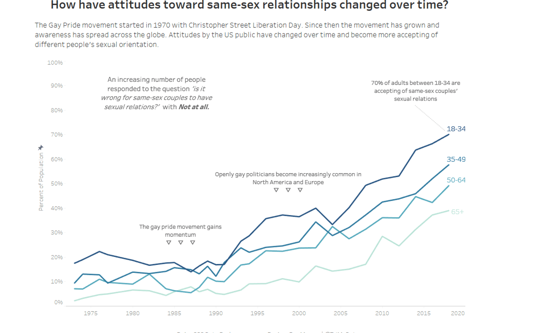
Here is the original viz:

What works well:
- It’s a simple line chart broken down by age group.
- It shows clearly that there is a positive trend with younger people leading the charge when it comes to being open-minded and accepting of differences in sexual orientation.
- The axis labels are clear.
- The colors work well.
What could be improved:
- The spikes and changes in the lines should be annotated for explanation.
- The aspect ratio of the chart should be 3:2 not square.
- Labeling the ends of the lines would probably be better than a separate color legend.
- The citations aren’t easy to read.
- Adding a description of who was asked (i.e. what country were those people from?) would be good. It’s very common in my experience for US data sources to neglect this information and I will bite my tongue not to add my opinion here on that behaviour here.
- Additional background information would be helpful to have.
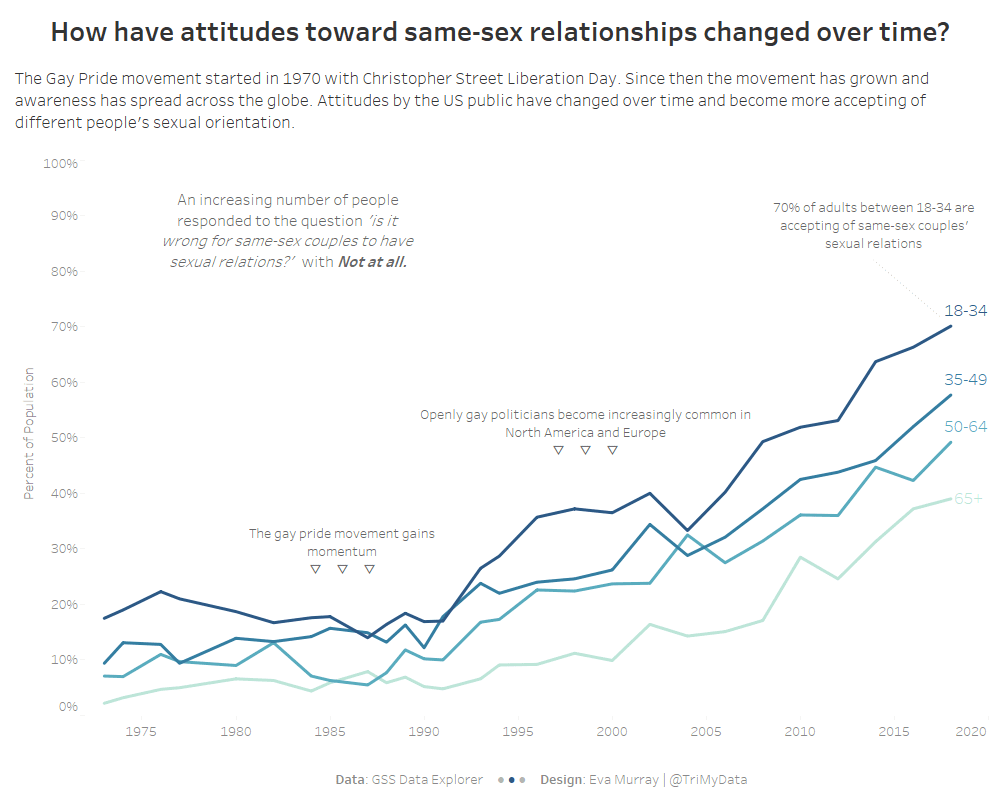
What I did:
- An annotated line chart, highlighting the developments that may have contributed to the changes in attitudes.
- Using a 3:2 aspect ratio for the chart.
- Adding a description to provide more information.


