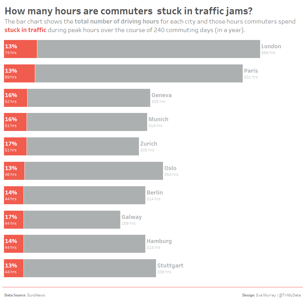

Traffic jams are an unpleasant side effect of living in cities and driving cars. After my move to Nuremberg last August, my commute changed significantly. Instead of a frustrating 60min drive each way, I now spend a pleasant 12-14 minutes riding my city cruiser bike to the office. 10min on my race bike. 14 minutes if I carry lots of smoothies in my bag and have to drag myself up the ‘hill’ on the way. There are bike lanes, I could also take a scenic detour along the lake, and by taking backroads I can avoid a bunch of traffic lights.This to me doesn’t even count as a commute. It’s just long enough to put a fresh glow on my cheeks in the morning and mess up my freshly blow-dried hair into a mix of wind-swept and helmet-hair.There are a lot of people, however, who drive to their work every day and spend A LOT of their time stuck in traffic. And that’s the data we’re looking at for Makeover Monday this week.The original visualization comes from EuroNews: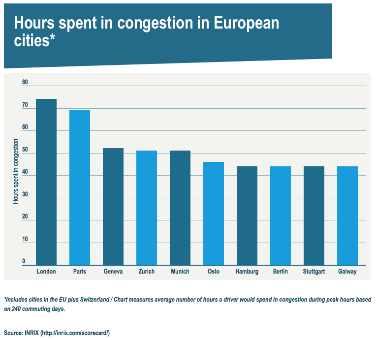
What works well:
- A simple bar chart with clear labels of the bars and the y-axis
- The title is concise and simple, supported by a footnote to clarify how ‘hours in congestion’ is defined
- The source is included
- The measure is very simple: number of hours spent in congestion. Most people, at least those who drive, can relate to it
- Bars are sorted in descending order
What could be improved:
- The colors of the bars don’t have real meaning and instead just differentiate the alternating bars. Color should have meaning or be removed.
- For my liking there are too many gridlines. I’d remove them and put the hour value labels on top of the bars
- The title doesn’t read very well. Congestion seems like a complicated word. Why not just use ‘traffic jam’?
- The shading behind the title is distracting
What I did:
- I felt the hours spent in congestion needed to be seen in the context of the total driving time
- I wanted a simple bar chart because they can be so effective at showing comparisons
- I included a percentage from the original source data to show what proportion of total peak hour driving time is sent in congestion
- I had a good look at the original dataset which has many more cities. Reading the source article ALWAYS helps with getting a better understanding of the background.